

Rebranding: The Fear of the New
With both Instagram and Uber recently revealing new looks to a very mixed response, it’s not a surprise many businesses fear a rebrand.
But rebranding a company can be a very positive thing – often increasing sales and allowing your brand to better connect with your target audience.
Taking Uber and Instagram as our examples, let’s see where they could have improved…

1. LESS IS MORE
If your current look has helped you build up popularity, you should be sensitive to this when looking at a brand refresh. Sometimes just adjusting the type setting, a slight tweak in your colour palette or changing the tagline can be a small enough change to make an effective difference without causing confusion to your audience.
Instagram has already had more than one look since launch, with various small updates to the app icon not causing any backlash or confusion. Indeed the first brand refresh they had was highly successful, simply re-positioning the letters to make Instagram’s handwritten font look much more worthy of a new social media platform.

2. KEEP WHAT IS GOOD
Most often when you are booking an Uber you are looking for a quick solution – whether you’ve missed a train, are rushing to a meeting or have had one two many drinks, when your app icon is an essential part of how customers make a sale with you, you have to be mindful.
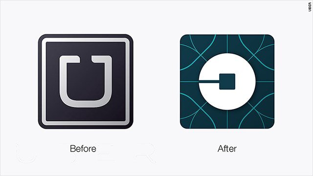
The previous app logo looked more like an U, which is important if you’re trying to quickly find the app on your phone after a few drinks!
Will we get used to Uber’s new logo? Of course. But for me not having a ‘U’ shape in their new logo is an error. From a design perspective, I actually prefer the new colour scheme and look, but their new mark doesn’t echo their distinct square ‘U’ shape and they had very successfully managed to make that shape their own in just a few years. And I’m not the only one to think this. One quick change I would make? Flip the new ‘bit’ icon 90 degrees, and suddenly we’re a little closer to the U.

3. TELL PEOPLE
Your customers can be your biggest brand ambassadors or your harshest critics. Imagine you use a product or website frequently and one day when you go to buy it/visit it and it looks completely different – you’re bound to be put off a little, even if you then realise what’s happened. As humans we are naturally change averse, so the best way to unveil a new look is to introduce it to your customers bit by bit, or with teasers, giving people time to adjust.
Instagram’s biggest blunder is that the change was simply rolled out. While they did take the time to create a video to explain the new look, and have since posted several artists’ versions of their logo, it all feels a little post rationalised – in my opinion they would have done better to start posting clues showing the colours and influences or 3-4 weeks before the new look, among other content to create intrigue rather than disgust/shock.

No one likes to be confused… help them out by warming people up for a rebrand and then reassuring them they’re in the right place when you have rolled out the new look
4. DON’T BE TRENDY
Ok, there are exceptions for this – hip new bars that are opening, magazines or streetwear labels, but in general going for a look that’s fashionable for your logo isn’t a good idea as it ages very quickly. Despite Instagram being a social media channel, and therefore by default trendy, I would be surprised if their new look lasts very well. Will we see a tweak to it in 2018 and again in 2020? I think so. The simplification of the camera line was bound to happen at some point, but the purple-pink-orange gradient? I’ll get used to it, but it does make me think of PowerPoint…
Looking to rebrand?
Let us guide you and your customers through it effortlessly.
View some of our Rebrands:


