5 Mistakes Startups Make (& How To Avoid Them)
This week I had the pleasure of speaking to a group of entrepreneurs and business owners at Google Campus about the mistakes I most often see startups make.
Please enjoy the full talk below, or scroll down for a summary of the 5 mistakes I most often see made, and my tips on what you can do instead:
The 5 Most Common Mistakes
& How To Avoid Them
1. Bad Naming
Mistake:
Naming is famously hard, but why do many startups end up with strange or long winded names? It's often because startups are obsessed with finding a 'verb' name (like Google or Shazam), then add to the mix finding a domain name that's available, and things start to get obscure.
How to avoid:
Remember that the brand names we use as verbs often aren't actually verbs! Think WhatsApp, Skype or Facebook - none of these are verbs and yet people use them that way. Why? Because their businesses are so good that we use these apps/sites everyday and their brand names have become a part of our language. So instead of dwelling on wanting your name to be a verb, focus on coming up with something short, catchy and broad enough to not pin your business down too much. And above all, don't rule out a good name because the .com isn't available - instead get creative e.g. 'weare[brandname].com' or '[brandname]app.com' are good options.
2. Not Using Colour Effectively
Mistake:
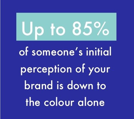
Using multiple colours, or having one main colour but not using it boldly enough. Why is this a mistake? Well once you learn that up to 85% of someone's initial perception is made up from the colour, you'll see why you want to unmistakable about what your brand colour is.
How to avoid:
Pick a shade of a colour that is unlike your competitors - ideally something that looks completely different from all the other colours in your industry - and run with it. At least for an emerging brand this is the best policy, then you can introduce a more sophisticated colour palette down the line once your business has evolved and grown.
3. Being Forgettable
Mistake:
Every startup out there looks the same - similar explainer videos, device screenshots etc. But to be successful in business you need to be disruptive - not only in your business idea, but how you present your brand.
How to avoid
Think creatively about your service/app - then put those benefits into language that will resonate with your audience, and market that way. So instead of telling them the time saving benefits of using your app, why not tell a story of a busy dad who only ever gets home once his children are in bed, who gets home 15 minutes earlier by using your app and can read his daughters a bedtime story? It's about cutting through the noise and giving people a reason to remember you.
Left: Deezer's 2016 launch campaign made it impossible to forget their name. View here
4. Looking generic
Mistake:
Stock images are a blessing, especially for early stage businesses without the budget for their own photoshoot. But they say an image is worth a thousand words, so why do so many startups make themselves look so generic by using an amalgam of stock images?
How to avoid:
When you're choosing stock images, be aware of the aesthetic in each image - are the images brightly lit, or softly? Do they have a narrow depth of field (the background is blurry but the foreground focused) or are they crisp throughout? Are the subjects all young and informal? Are the images taken as if a fly on the wall, or are they posed? Collect all your prospective images into a library and delete out any that don't feel the same until you have a library that looks like it could all have been photographed by the same photographer, in the same shoot, and you'll end up looking far more professional.
Define a 'house style' for your imagery, like Treatwell
5. Rush Branding
Mistake:
The branding is left to the last minute, so they have a logo but it feels 'plonked on' to their website, app, social media and marketing materials.
How to avoid:
Branding is about more than just a logo, a lot more. So by working with a graphic designer a few months before you launch, they'll be able to advise you on the colours and fonts you should be using, and how you can bring them through your site, app and marketing. They can also help you devise some unique brand graphics such as bespoke patterns, icons or illustrations that can be used in your marketing to weave through a consistent and strong brand identity.


