Rebrand Roundup: Autumn 2018
So, it seems the back-to-school attitude really resonated this year, with no fewer than 5 high profile companies going through a rebrand this September and October.
View the video to hear my thoughts on the new branding for John Lewis, Waitrose, Uber, Debenhams and Mailchimp ->
John Lewis & Waitrose
The low down
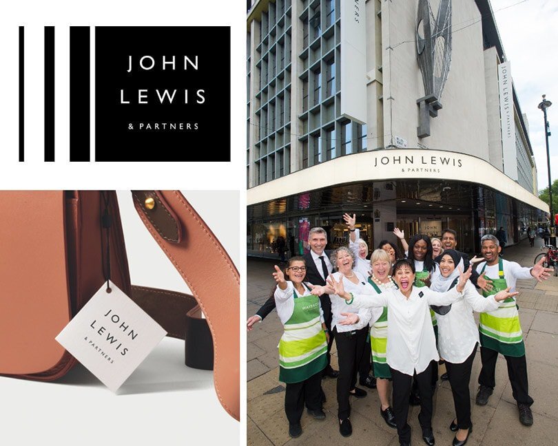
This August the John Lewis group announced that both retail brands - John Lewis and Waitrose would rebrand to include ‘& Partners’ in their brand names, a plan that had apparently been intended for some years.
The visuals
The bottom line
Two smart new logos, but do they have the same trust factor as their previous lower case versions. Also sad to see another heritage high street brand let go of their brand colour green (after M&S did in 2014).
Uber
The low down
For the 3rd time in just 8 years Uber opt for a major rebrand.
The visuals
Uber’s brand history: 2012, 2016, 2017 and the latest rebrand in 2018
A return to the U icon - a suggestion I made to connect Uber’s 2016 ‘abstract’ rebrand with their name for easy usability
The bottom line
It works, but it’s a bit boring. (And I’m not the only one to think so).
Debenhams
The low down
Debenhams change their logo for the first time in almost 20 years. They also embrace bright new brand colours and illustrations as part of their new identity.
The visuals
The bottom line
It’s not a drastic change to move from one monochrome serif font to another, but it’s more modern and fresh, and I like it for the brand.
Mailchimp
The low down
Mailchimp rebrand in an attempt to both modernise their brand and to shift the focus from technology to creativity.
The visuals
The bottom line
While this is a lovely bold brand identity, for me it’s not fitting for Mailchimp, who have made their name as a jargon free email marketing service. Read Stedman Halliday’s article for a similar review.


