Wings
Situation
We were delighted to be approached by Wings Interactive, a micro-fund that invests in games by women and marginalized genders as there’s nothing closer to my heart than supporting women in business. With investment already secured from some major tech companies, they needed a brand identity with impact to spread their message and create awareness of their services.
As featured by:
“We had no knowledge of the brand development process, and Cara guided us expertly through to delivering awesome branding for our company that we're very happy with.”
— Cassia Curran, Founder of Wings Interactive
Discovery
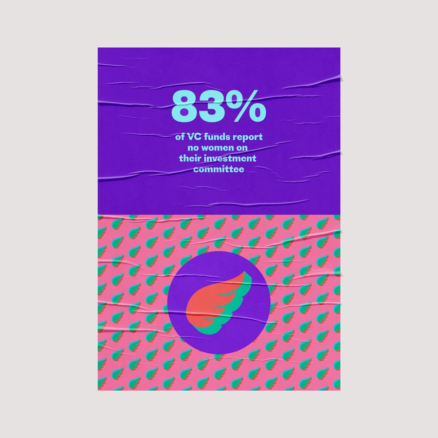
Less than 1% of all VC funding in the UK (across all industries) goes to female founding teams. Only 17% of game developers are female. Fewer than 1 in 5 female gamers feel included in the gaming community.
There is a big sexism problem in the games industry as it stands – from sexist roles for men and women in the games themselves to widespread and aggressive online abuse towards female gamers.
Games investment is predominantly male, and it’s difficult for women and minority developers to find the support they need to fulfil their vision (and feel valued by the games industry). This is where Wings comes in.
Moodboard & Concepts
We wanted an aesthetic that reflects the internet age and online gaming - vibrant, diverse and arresting. We drew inspiration from glitchy fonts, photo montage and deliberately clashing colour combinations to give a strong sense of attitude to the brand.
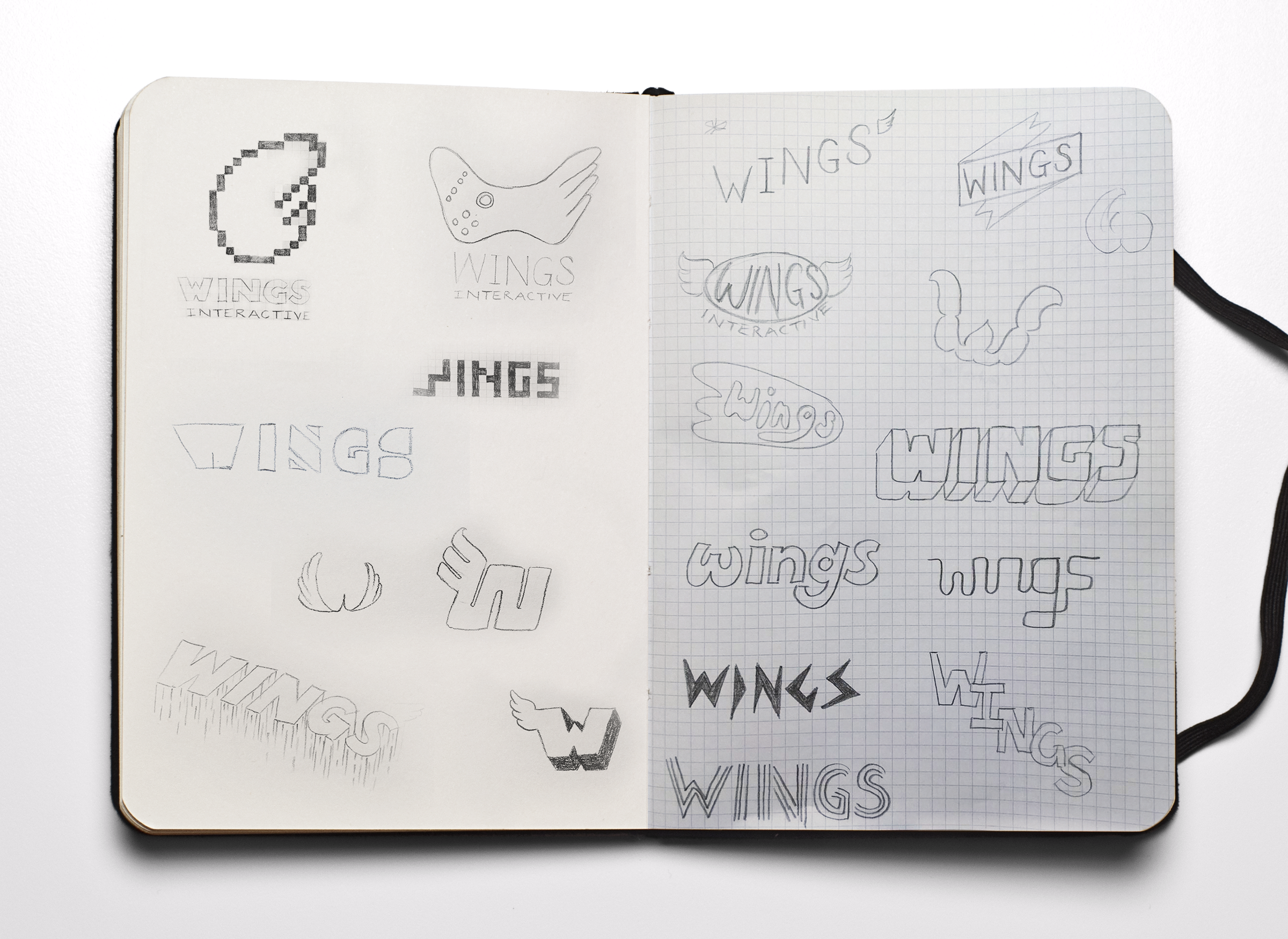
Some of the initial logo concept sketches
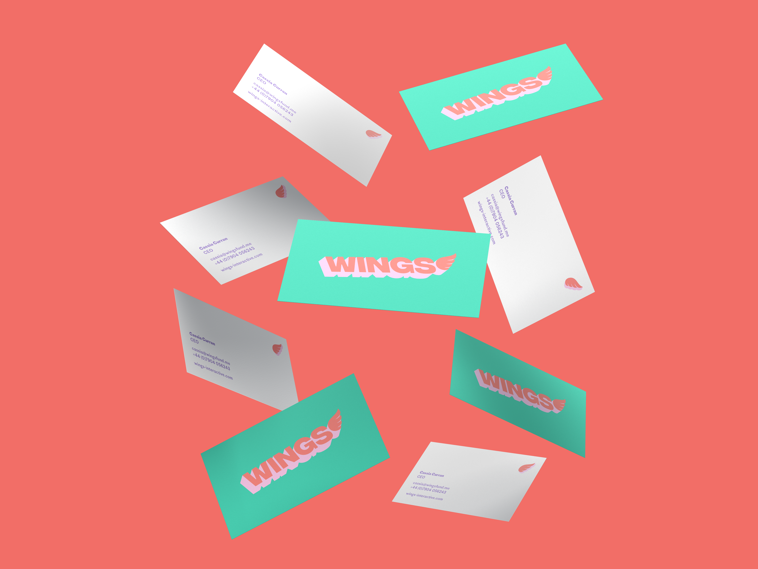
The client opted for the ‘platform’ concept, in which the brand name is rising on a diagonal with a contrasting 3D aspect, representing the platform the fund will provide to womxn game developers.
Through our background work, they identified the singer Billie Eilish as a representative of their ideal brand personality and we worked with this concept of ‘adorkable’ to create a playful identity with a hint of the popular vaporwave aesthetic, itself inspired by gaming.
Typography
We selected Proto Grotesk, created by award-winning typeface designer Jean-Baptiste Levée with Sandrine Nugue and Yoann Minet as the lead font for Wings’ brand.
With its distinct serifs it feels both retro and contemporary and oozes personality when used oversized within the brand for headings, and adds a subtle flair to body copy.

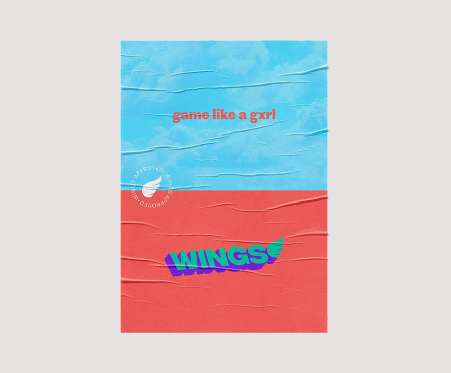
Wings is an unconventional games publisher for unconventional people – they fund only awesome games that just so happen to be created by womxn and diverse teams.



You can find out more about Wings Interactive and the great work they do on their website.
