When the world goes Zig, Zag
Would you be surprised if I told you that 85% of a person’s first impression of your brand is made up from colour alone? Well it’s true, and it’s one of the reasons utilising colour is the single most powerful thing you can do to create a brand that will be remembered.
But how can you utilise colour? Well the most effective way is to pick one colour and forge the connection between that exact shade or colour and your brand. Think Coca Cola red, Tiffany blue or Selfridges yellow.
But what if everyone else is using similar colours? I’ve seen a real boom in baby pink, peach and beige/neutral branding and I’m sure you have too. Indeed, Millennial Pink was named such as it was such a signature of the millennial aesthetic. These brands may all be very beautiful, but sooner or later they begin to merge into one in your mind.
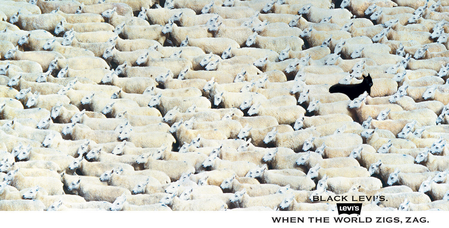
The answer is simple, when the rest of the world zigs... zag!
A advert for Levi’s in 1982 by agency BBH which showed the world they wanted to stand out and be remembered
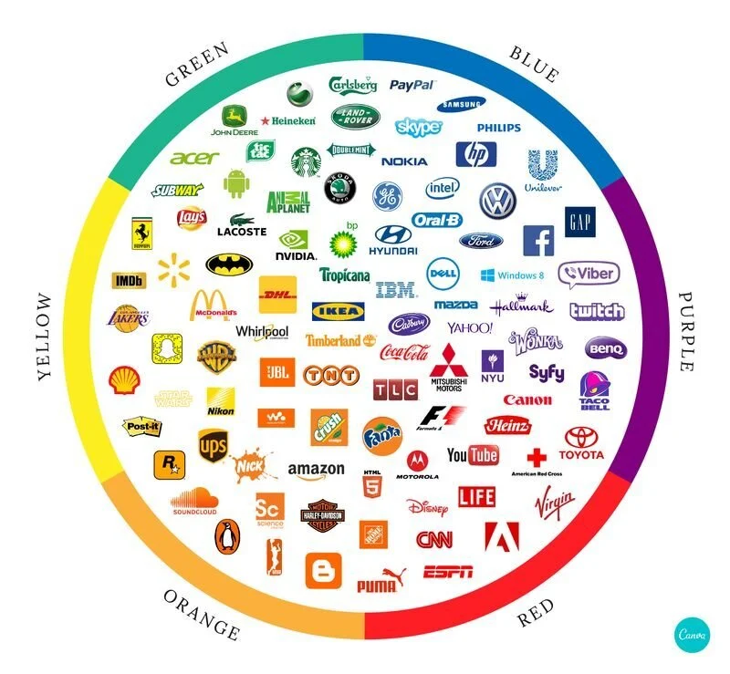
Look at the branding of others in your industry and try to see if there are any patterns, for example most tech companies favour blue, and then see how you could stand out immediately by jumping to the opposite side of the colour wheel. If everyone is using lots of colours, go bold and use just one.
Remember, the aim is to stand out against your competitors – not to have a colour that is totally unique and connected only with your brand, because the latter is not going to happen.
Here are a couple of examples to get you started:
Yahoo
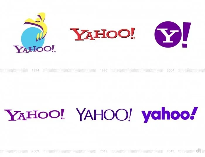
Among a sea of blue ‘trustworthy’ tech logos, Yahoo opted for purple – a colour usually associated with luxury (Liberty’s & purple used to be reserved for Roman emperors), beauty (it’s commonly used for salons) and confectionary (Willy Wonka and Cadbury). While they have evolved their logo several times over the last 15 years, they have kept their brand purple*, which is now synonymous with the brand.
*Except for a wobble in 1996 which they changed soon after
Think Yahoo, think purple
Deliveroo
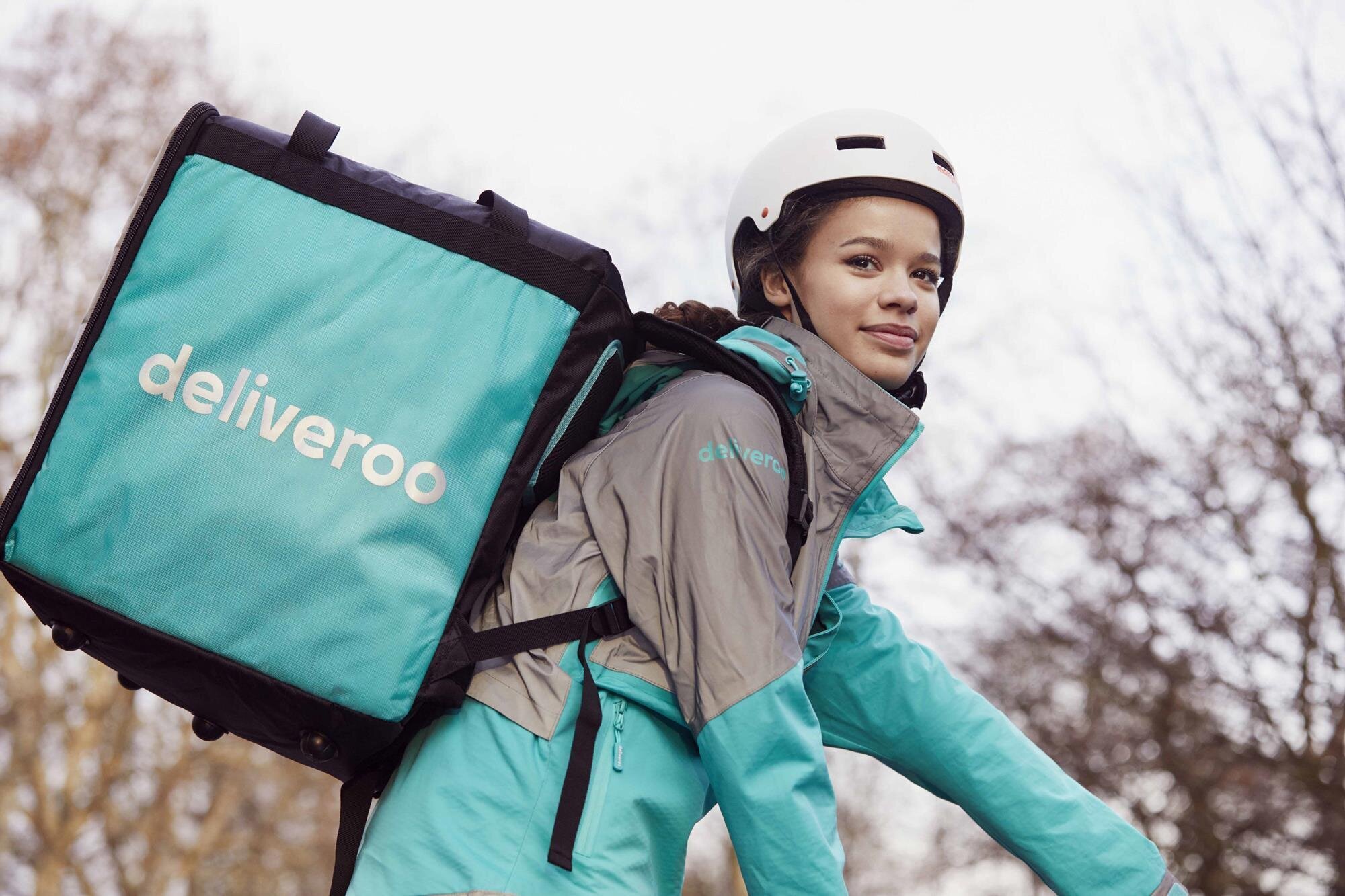
Launching onto the food take away scene with a bam in 2013, Deliveroo ‘zag’ed perfectly – the take-away market was drowning in red, yellow and black – traditionally ‘fast food’ colours, suiting the convenience of take away. But rather than blending in, Deliveroo turned things on their head – first by inviting healthier food options on to their platform, and by highlighting this point of difference with a fresh, zingy turquoise. Their cyclist delivery (rather than motorbike with driver all in black) also gave them an opportunity to create huge brand awareness – swathing their drivers and their delivery backpacks in the brand colour.
Stand out immediately by jumping to the opposite side of the colour wheel
So how can you apply this to your own brand? See what colours and styles are most common within your industry, pop all the other brands’ logos into a PowerPoint slide and see if one or two colours are more prominent. If there’s a clear colour or style coming out, think about how you could use a contrasting colour to zag and instantly stand out!
If there is a fair mix across the board, then colour may not be the way you will zag – but you can still stand out as a brand for many reasons, by having a distinct tone of voice, memorable content or a brilliant and innovative customer experience, to name a few.
Happy Zagging!
