Ánemos
SITUATION
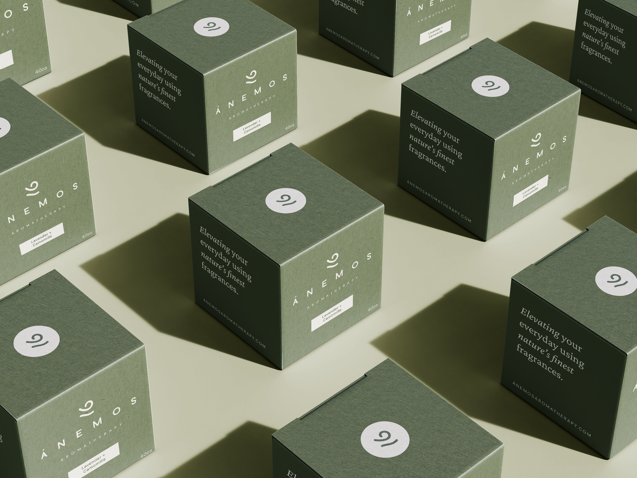
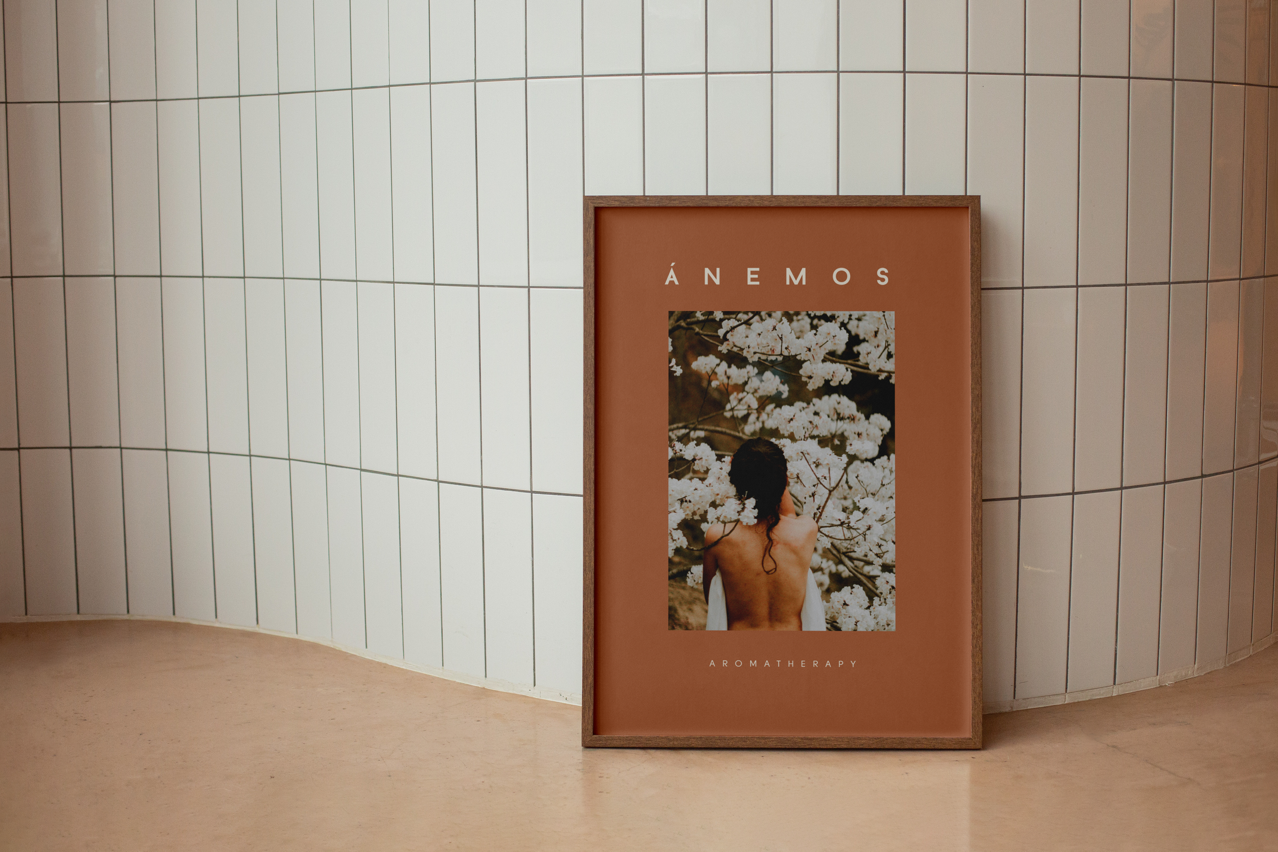
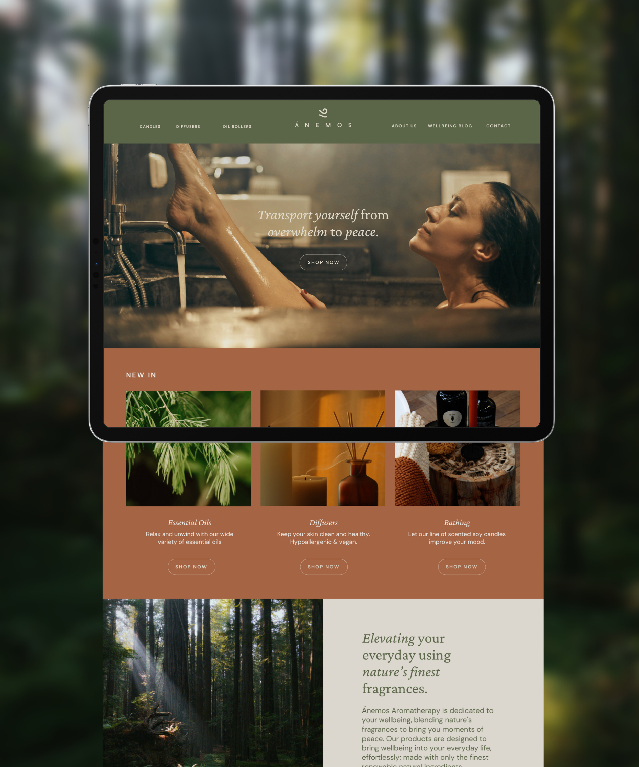
Ánemos is an aromatherapy brand that uses natural and environmentally friendly ingredients, to create products that promote health and healing for women who are busy, but still want to prioritise their wellbeing. Founded by a lawyer having experienced burnout, the products centre around self care and healing.
#1 Moodboard
The use of the colour green was instinctive to evoke the lusciousness of nature; we sought inspiration from lush foliage, forest bathing and wellbeing retreats to create a calm and inviting mood for the brand. A pop of warmth from cinnamon echoes the bark of trees, the warm glow of sunshine and the brand’s amber jar candles.
Logo concept
The brand name Ánemos, or in Greek, ἄνεμος, means ‘wind’ and is derived from the Proto-Indo-European word for ‘breathe’. For the brand icon, we drew inspiration from the flow of the wind and the curling of ferns.
The Final logo




“From the get-go I felt at ease and in the right hands to bring my brand identity to life. Cara really cares about what she does and making it work for her client in every way. Cara is very creative, experienced and I am beyond pleased with the work. Cannot thank you enough Cara!”
Stephanie Mosa
