The Dental Architect
We were approached by Dr Martina Hodgson, owner of a thriving family dentist practice in Wakefield to help her create a brand for her new practice in Leeds. Martina had already secured the premise for the new practice – a stunning Grade II listed building from the late 19th century – and wanted this, and the practice’s focus on Invisalign services, to set the tone for the brand.
“When I decided to open a new city-centre dental practice my vision was to create something with a luxury feel, that was still friendly and inviting. Cara understood what I wanted straight away and was able to put into words what I wanted, even better than me!
The most difficult part of the branding was actually coming up with a name, however Cara took me through a whole process (which was quite fun!) to come up with a name that reflected me personally as well as my brand.
I get so many compliments on the name and branding all the time, and I am very proud of what we have created.
I chose Cara and her team because their work is classy and I love that she champions women in business. Cara is super professional and a pleasure to work with and I would recommend her to anyone!”
— Dr Martina Hodgson, Founder & Lead Dentist, The Dental Architect
#1 Naming
We were all keen to avoid the usual clichés for dentists in both the name and logo, so we sought inspiration from the building history, the area and the benefit for the customer.
To Martina, the word ‘architect’ fit perfectly for the practice, honouring the technical intricacy and art of skilled dentistry, and also connecting the practice to the beautiful Neo-Gothic building which dates from 1873.
#2 Moodboard + visual identity
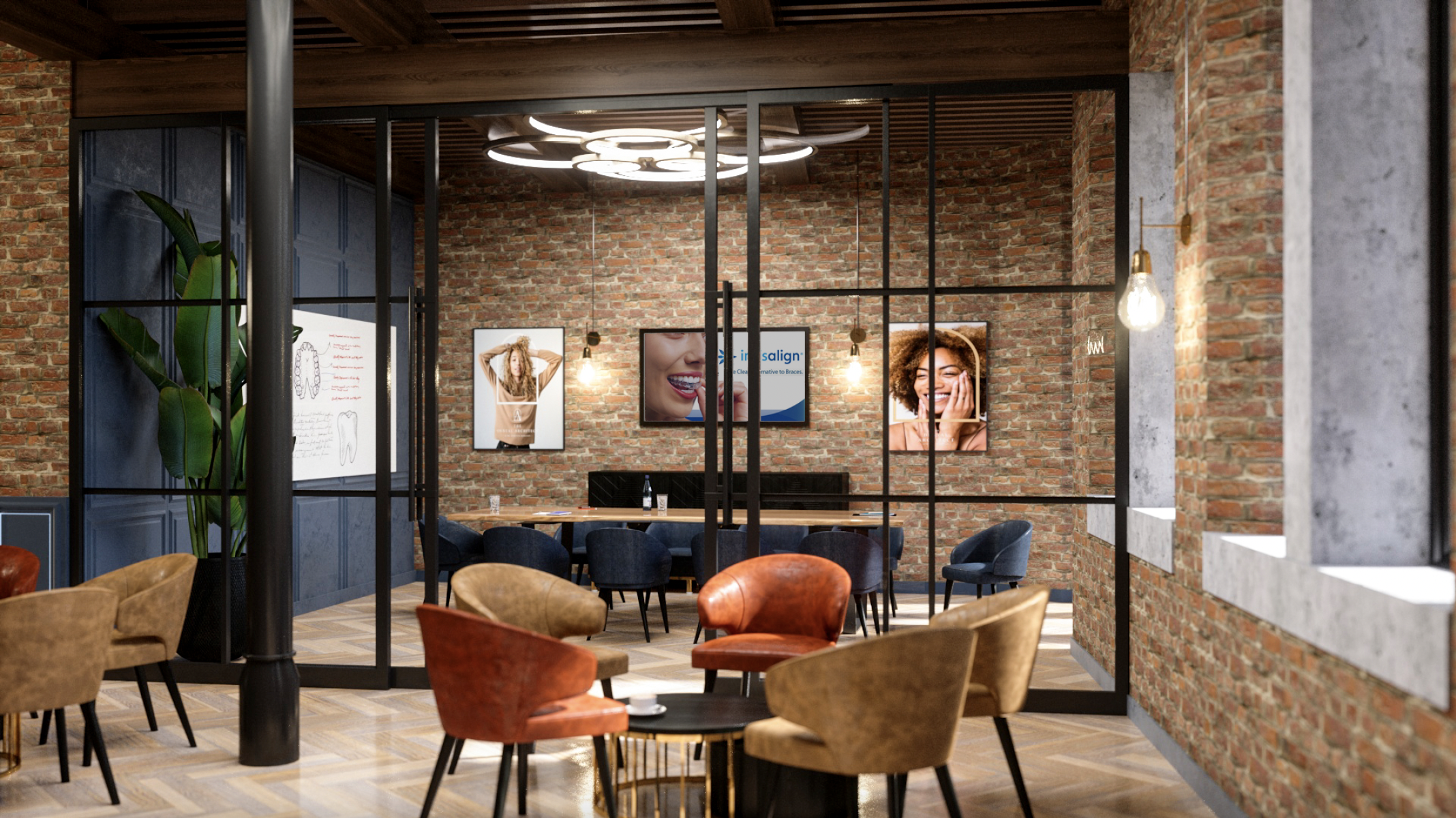
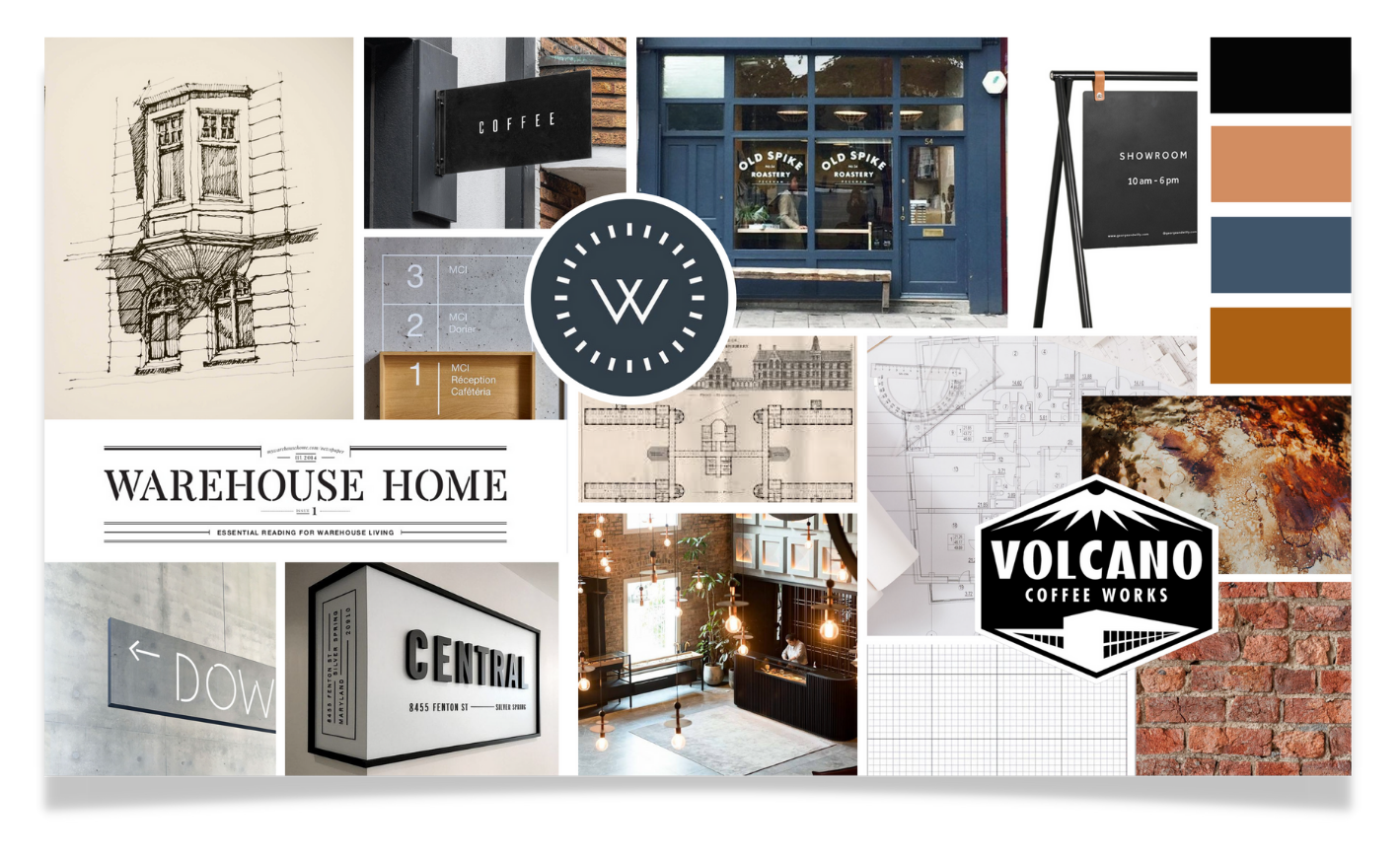
Martina knew that the styling of the interiors would be contemporary to contrast with the traditional aspect of the building, with exposed brick walls and leather accents as a nod to the building’s history as a leather warehouse.
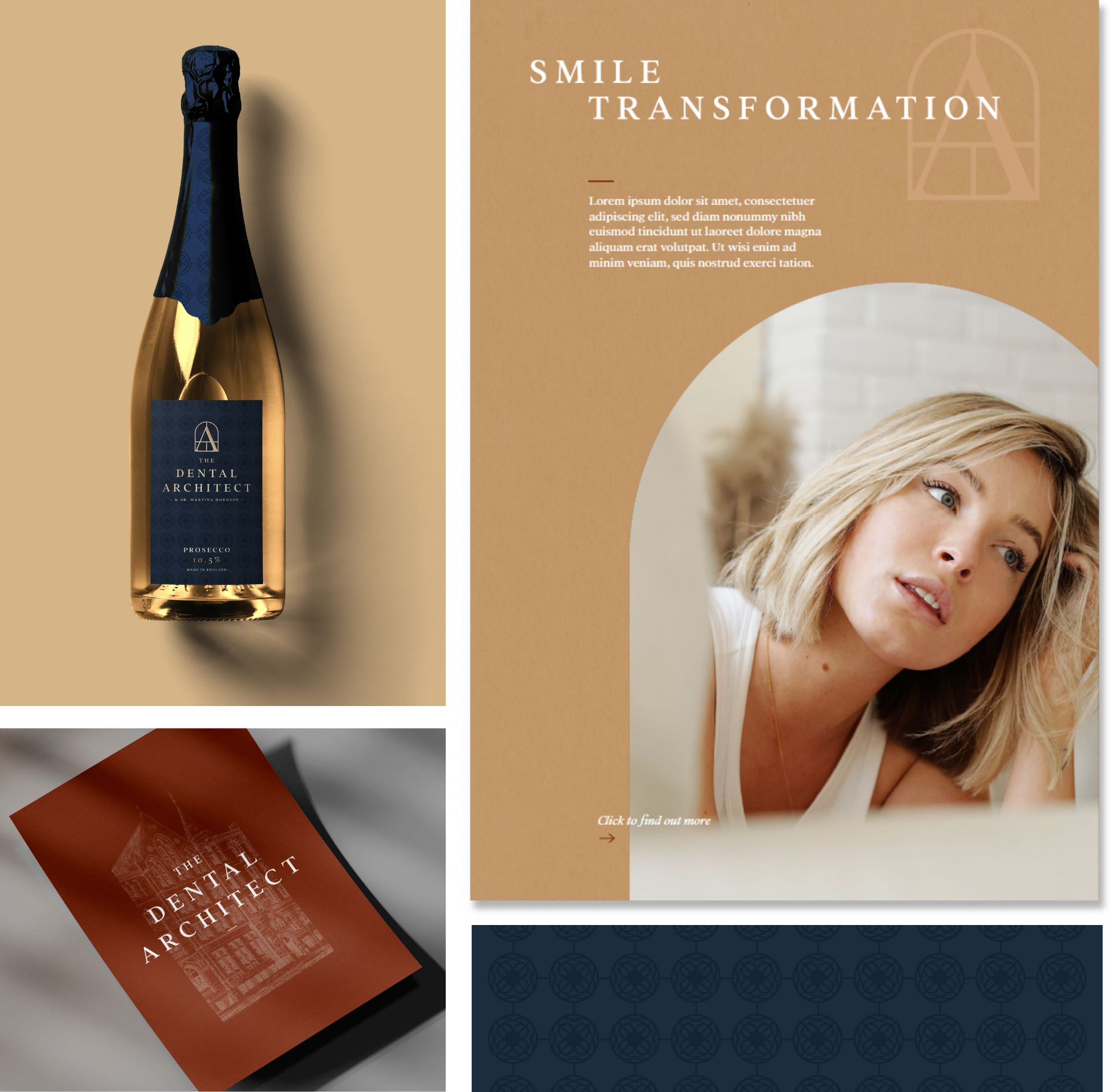
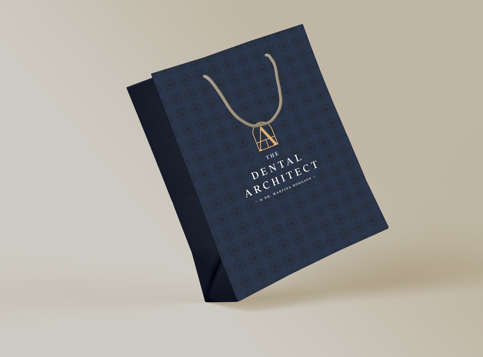
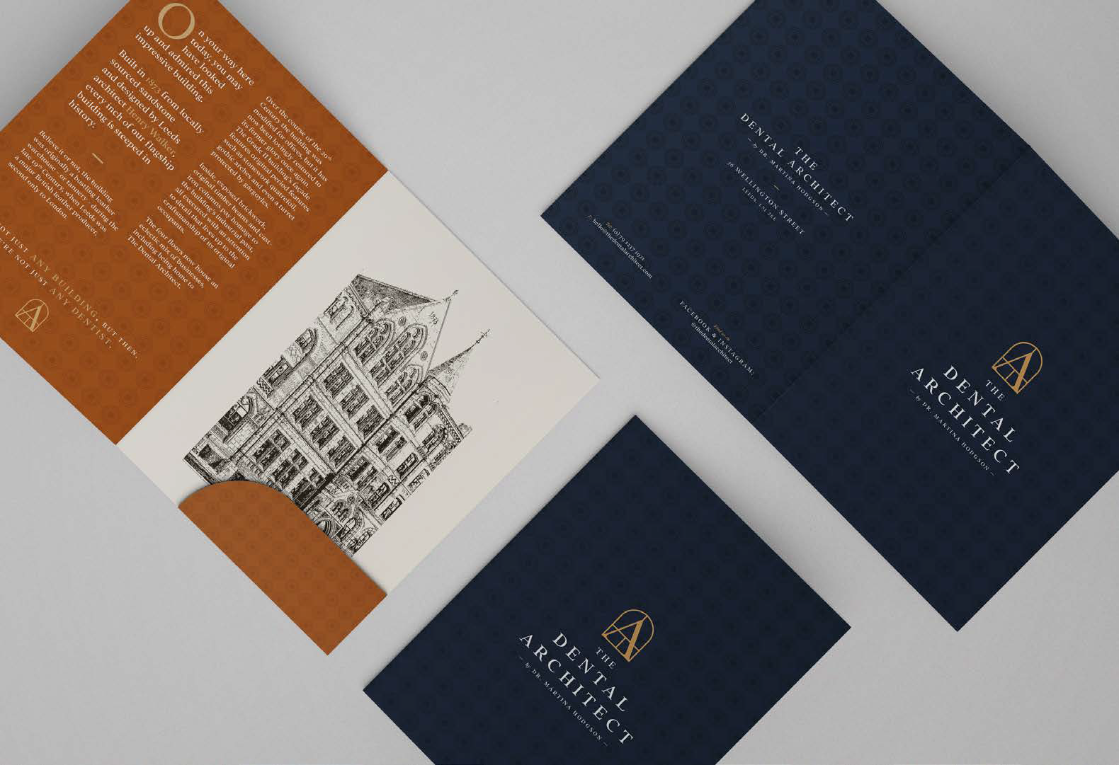
We knew this industrial styling should inform the branding too, and the moodboard features grey-blue with bronze and tan, and references to architects’ drawings. During the process, we further refined the colour palette, landing on a deep inky blue and our original tan colours, accented by gold, creating a polished result.
The Logo
The building's history also informed our typographic choices, which were inspired by the lettering of nineteenth-century maps, and the maker’s plates of cast-iron machinery.
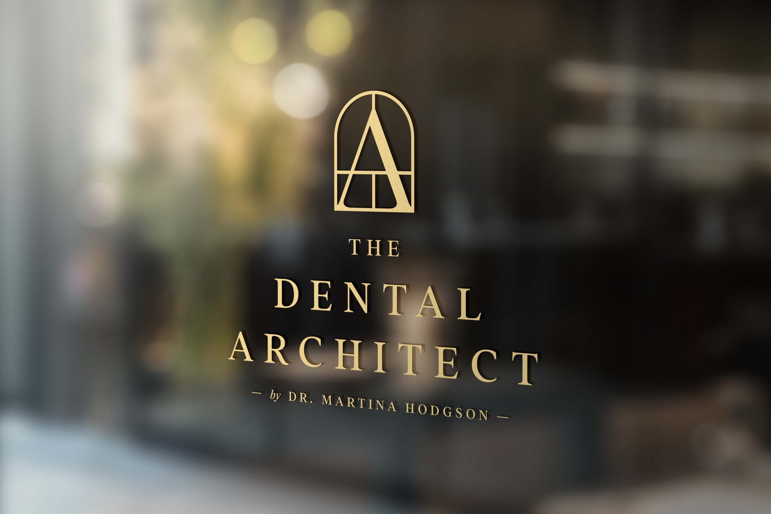
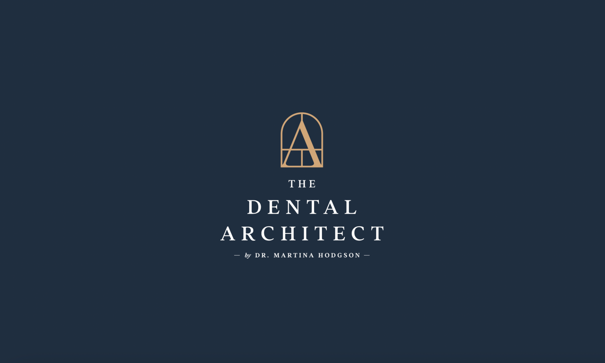
The elegant wordmark is balanced with a contemporary brand mark featuring the A for architect contained within an arch window, as featured on the apex of the facade.
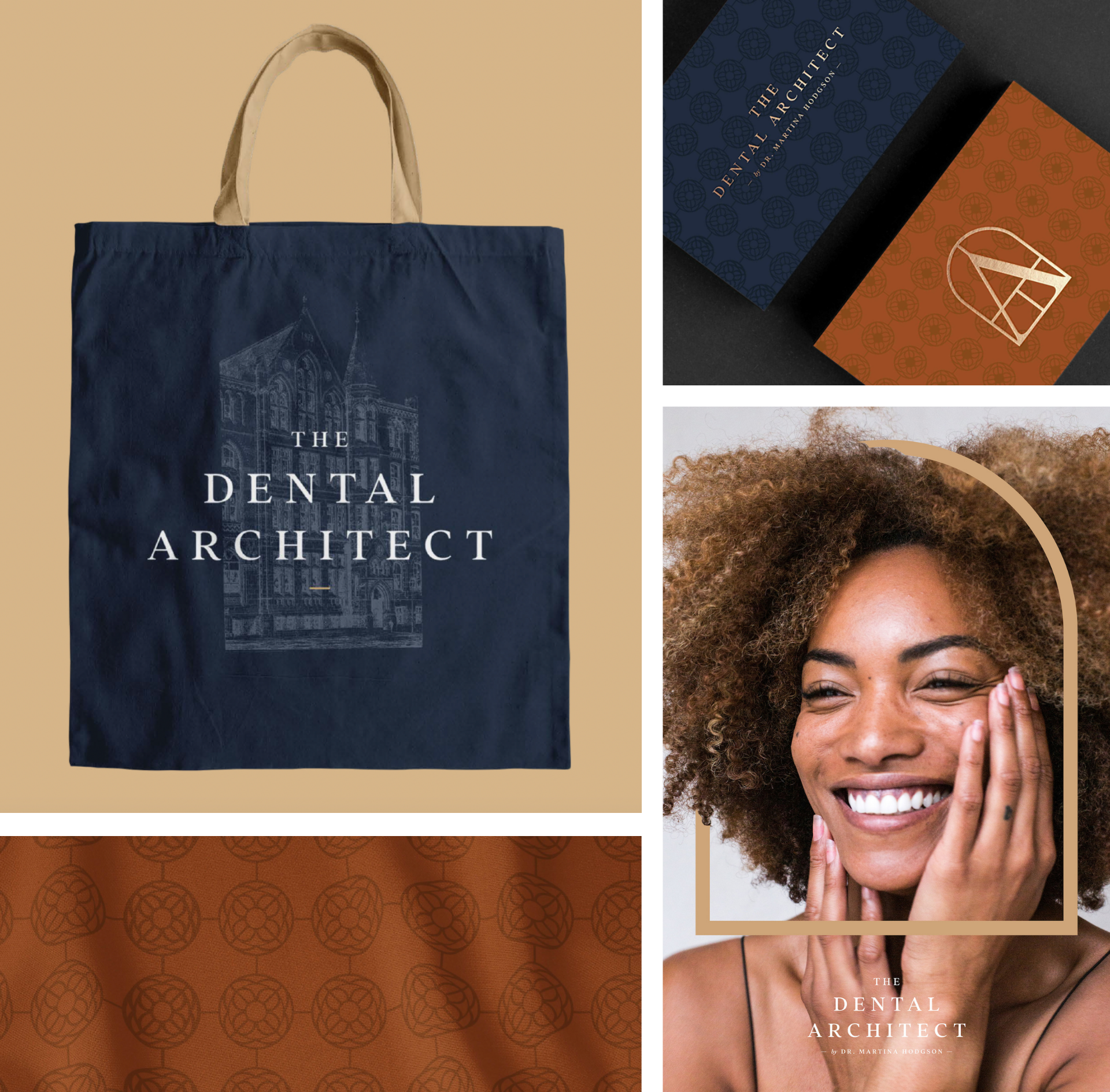
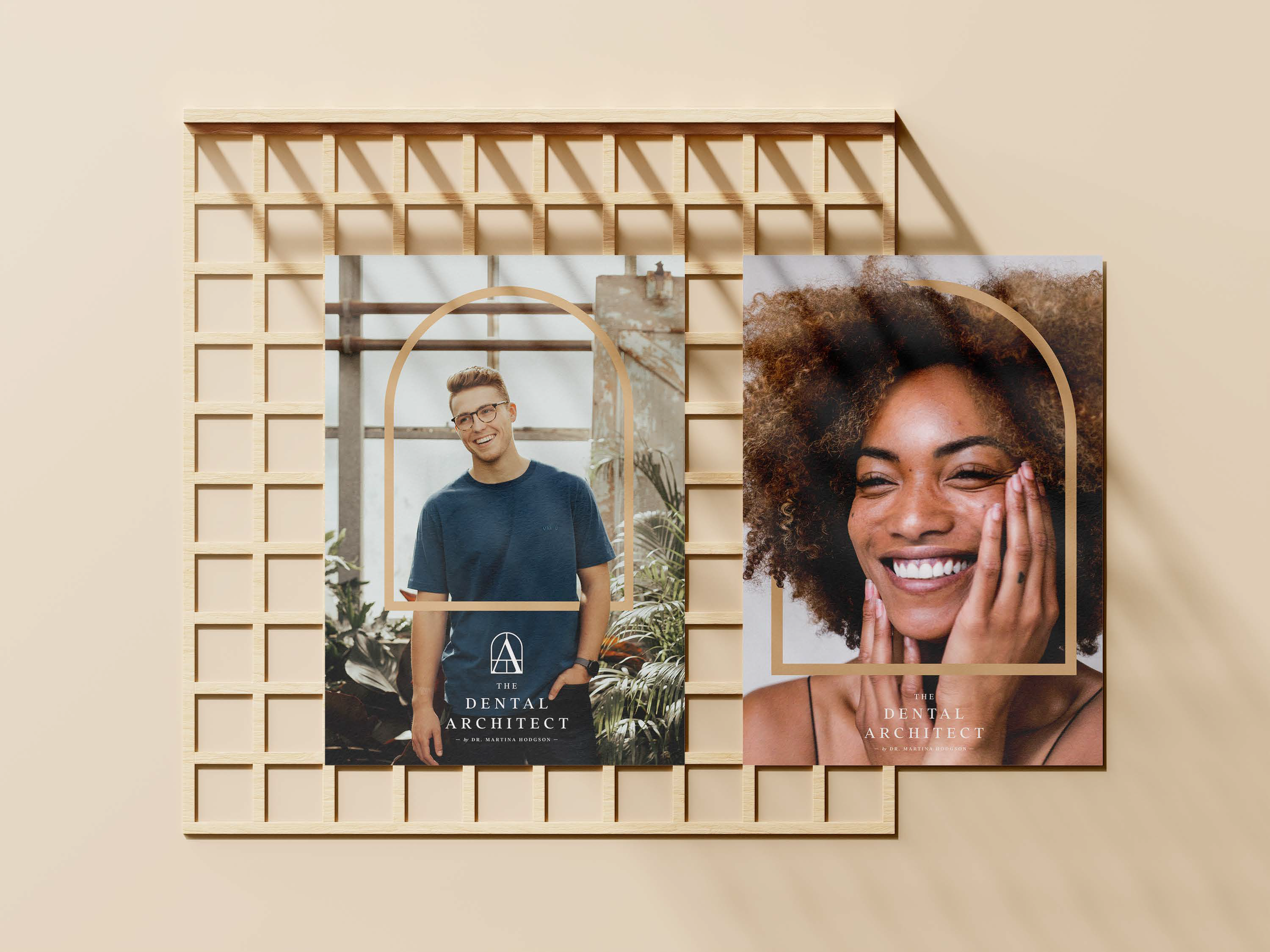
The arch element then translates into the identity, framing the happy recipients of new smiles. An illustration of the building and other architectural details weave through the identity, which includes a brand pattern which features a repeat of the rosette feature from the building’s exterior.
