Bays Consulting
Situation
Having established themselves in the market, statistical analysis company Bays Consulting wanted to invest in a considered brand image having never had their branding professionally designed before. Founder Sophie was keen for us to strike the balance between professional and creative, conveying her approach to data analysis.
Discovery
Bays’ previous brand was purple, a choice based on the team’s all female status at the time, however our discovery revealed that their target audience was overwhelmingly male and 40+ and much blue and purple was also being used by competitors so we begun our process by asking if we could have permission to change their brand colour. Upon revealing our findings, the Bays team gave us carte blanche to create the branding we felt was fitting, which led to some excellent creative.
The Moodboard
Within the branding of data analysis companies, visual clichés pervade so we put together a clear ‘what not to do’ list, alongside our visual moodboard. Central to Bays’ work is the idea that mathematics is creative, and that data is human so we sought ways to create a brand identity that is professional but also creative and warm. We chose bright citrus colours to stand out well from the predominantly blue and purple landscape of competitors.
Concepting
We took inspiration from geometry and the mathematic divide symbol, which is a shorthand for the equation that makes up Bayes' theorem (from which Bays’ name is derived).
All rights reserved
The client was immediately drawn to the simplicity and elegance of route 6.
A transformation
Alongside the new logo, we created a contemporary and bold identity for the brand.
“Cara was really supportive throughout the whole experience. This meant I dared to be brave (who knew orange was the right colour!) and went with a design that captured me from the moment I saw it. The idea is genius and the new brand captures the company perfectly.”
Roll out
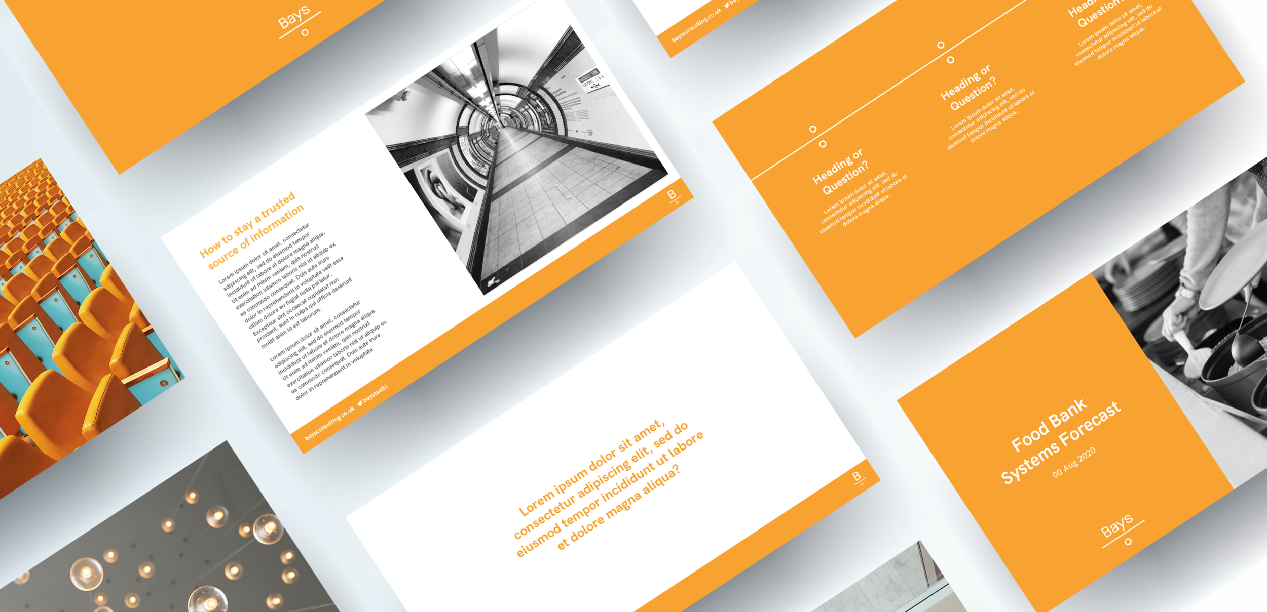
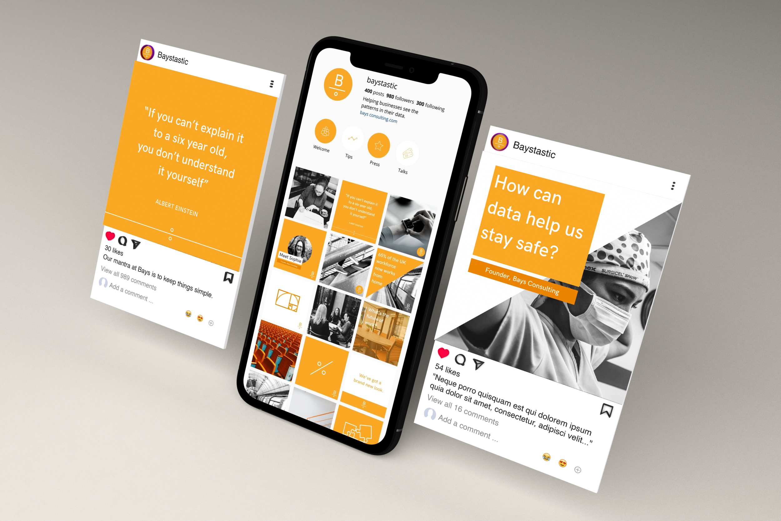
We additionally created some stationary items, a presentation template and a suite of social media assets to ensure that the team had all the resources they need for business in the new brand.


