
A Better Place
SITUATION
A Better Place is an online curated marketplace with strong ethical values at its heart. The website promotes ‘ethical consumerism’ by providing a range of handpicked, cruelty free, fair trade and hand made goods for all areas of life, from mens’ grooming to kitchenware.
A Better Place was founded by Sophie Lippiatt, whose passion for the idea saw ABP exceed the crowdfunding total they set for the launch. Sophie approached us looking for a consistent and professional brand image that could be applied across the business, for their packaging, cards, website and social media.
CONCEPT
Stylistically we started with quite a particular brief for this project. The client was drawn strongly toward a look that was soft & feminine perhaps incorporating hand drawn or hand lettered elements.
Route 1: Strong not sweet
Route 2: Inviting & Homespun
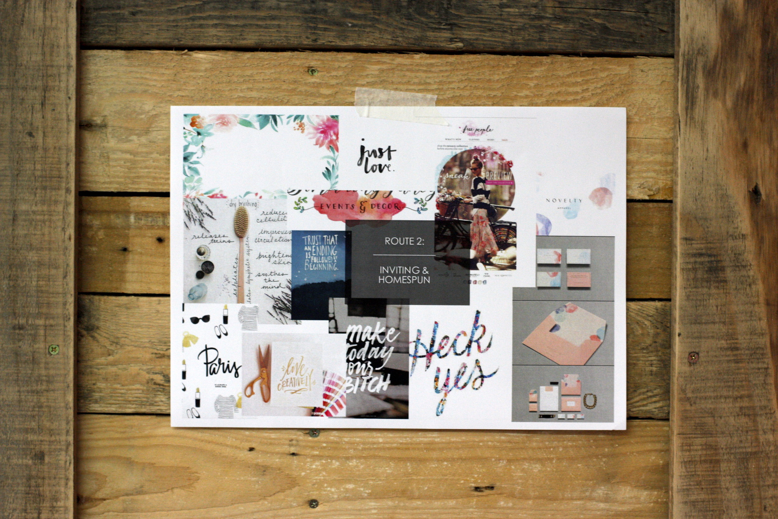
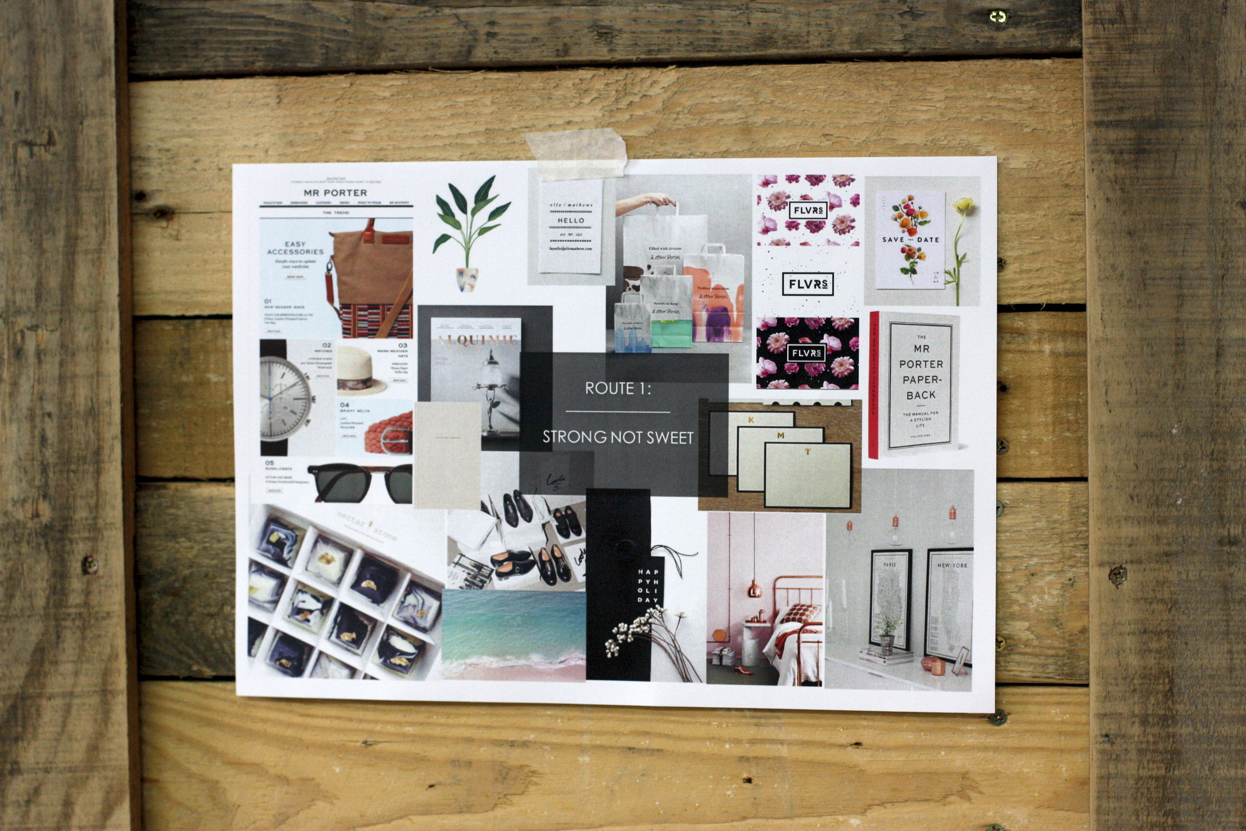
During our brainstorm and moodboard phases together with the client we moved more towards a strong style, removing the whimsical feel. We felt this would ensure the brand would also appeal to those all important male customers; or indeed female customers buying for male friends & family.

Impotant identifyication of consumer base for A Better Place.
A CLEAR MISSION
As a writer, Sophie had taken time already to voice A Better Place’s mission, however her statement was around 700 words long - in other words, too long to be quickly digested by time poor people overloaded with content online. While Sophie struggled to explain all aspects of the brand with brevity, my job was made a lot easier with her words as a starting place - and I knew we could condense the essence of this into 100 words or less, and I also knew I wanted to use the statement as a place to explain and reinforce the brand name.

The final mission statement
DEVELOPING THE IDENTITY
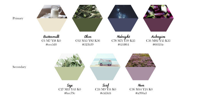
A Better Place embodies a lifestyle and a culture, focusing on social responsibility and more environmentally-friendly spending choices. We wanted to evoke a sense of environment in the brand design, using imagery of landscapes and references to flora and fauna. We drew earthy colours from these points of inspiration, shades of purple, green, and beige came to the forefront of our vision for the brand.
COLOUR PALETTE
For the logo we knew early on that it would be used almost as much in print as online, so it was important to create something and malleable for different media. The logo needed to sit well on top of other imagery, as a watermark, but be strong enough as a standalone icon.
DESIGN
Taking from nature, we evolved a honeycomb shape to be the emblematic signature of the brand, with A Better Place in a chic, slim sans serif typeface at the centre.

For the logo we knew early on that it would be used almost as much in print as online, so it was important to create something and malleable for different media. The logo needed to sit well on top of other imagery, as a watermark, but be strong enough as a standalone icon.
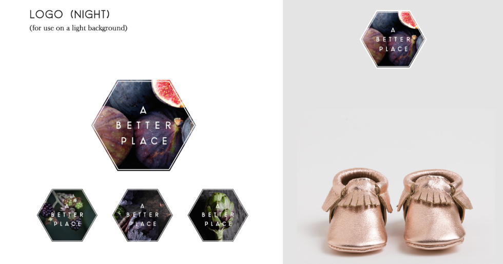
A MODULAR IDENTITY
We decided to create a modular identity for the brand, offering variety to their brand image throughout different seasons and in different uses, but always reinforcing the commitment to the planet, with images of nature used throughout. To continue the theme, we created two suites of logos - 'night’ and ‘day’.
The ‘Night’ versions of the logo for use on light backgrounds, and four ‘Day’ options create a dramatic contrast on dark images.

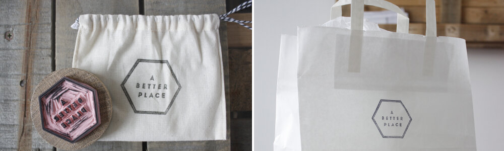
APPLYING THE BRAND
As with the identity design, every part of the project needed to be as ethically considered as possible - as part of this we designed a stamp that was created locally by a small business, both reducing the environmental impact of having stickers made for branding the product packaging and supporting another small business.
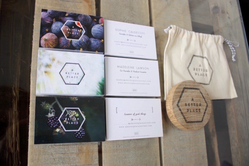
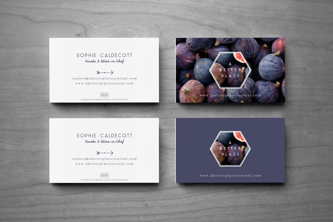
The business cards were also particularly interesting - not only did we print on recycled paper, but we also worked with an excellent ethical small printer who used 100% vegetable inks for the colours. I was concerned that with this and the paper choice, the colours would be absorbed and not vibrant, but I found myself very pleasantly surprised, with the vegetable inks providing rich tones, and leaving a pleasant sheen to the surface (we skipped lamination as this process is not environmentally friendly).
The new branding being used across business cards, and a handmade stamp to create low cost (and low waste) packaging.
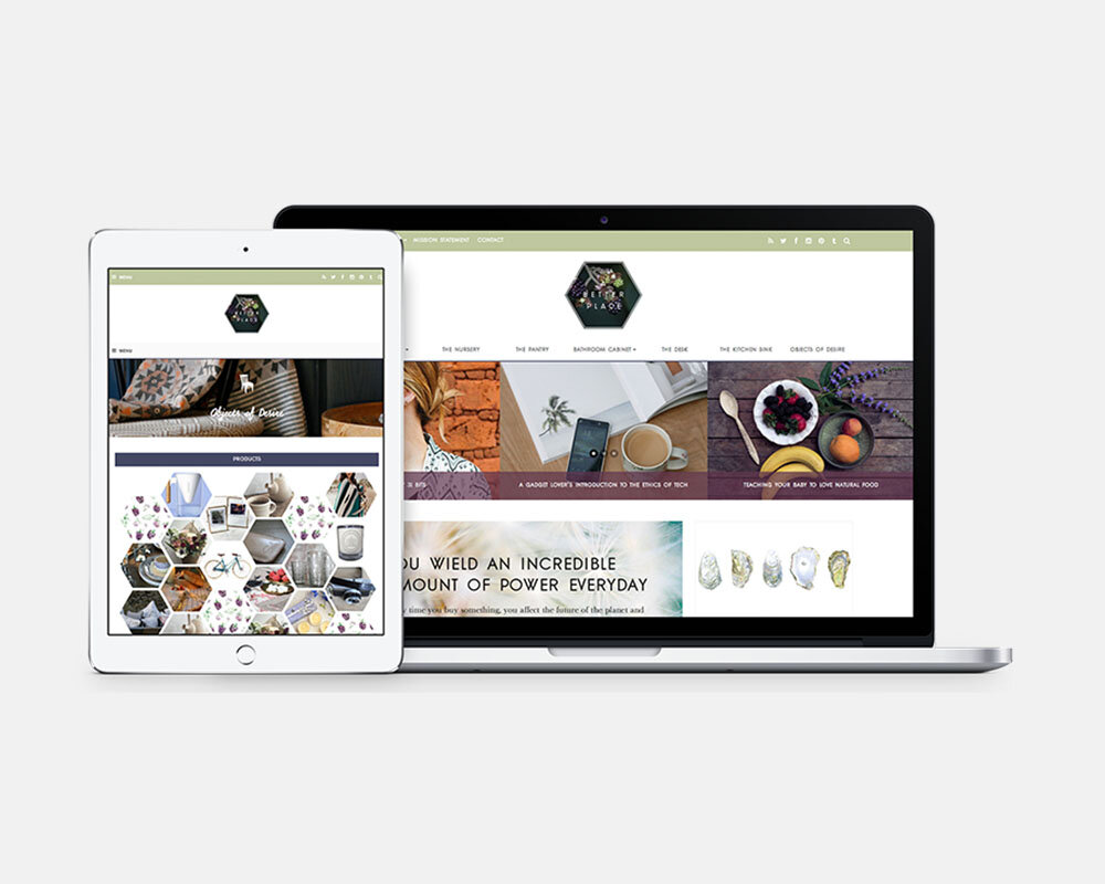
WEBSITE
We then handed over the reins to Libby at Joy Design for the website design and build. Libby’s designs brought together the brand elements, including a unique custom build product display featuring items in responsive hexagon shapes, echoing the geometric shape of the logo.
The website is aesthetically, functionally and in its content a perfect embodiment of the brand we created.
“Cara is exceptional at sensitively balancing a whole variety of different needs and turning them into a coherent brand that feels so natural and right. I was so impressed with how patient she was as she guided us through the process, and we are so happy with the finished brand look. Creating a brand is so personal, and we couldn't have done it without her and her brilliant team! “
Sophie Lippiatt, Founder of A Better Place
Do go and pay it a visit: www.abetterplacejournal.com