

Triggtel
Situation
Software developer Bruce and his business partner reached out to me seeking complete brand creation for his communication app for businesses. We supported with naming, created a brand identity and helped the team secure trademarks for the business.
Situation
Software developer Bruce and his business partner reached out to me seeking complete brand creation for his communication app for businesses. We supported with naming, created a brand identity and helped the team secure trademarks for the business.
Situation
Software developer Bruce and his business partner reached out to me seeking complete brand creation for his communication app for businesses. We supported with naming, created a brand identity and helped the team secure trademarks for the business.
Background
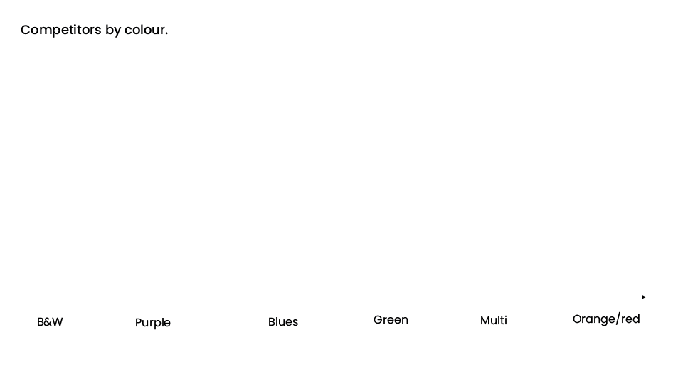
Following our discovery session with Bruce and Melissa, we conducted research of the main competitors’ branding and websites. This enabled us to identify the way Voice over Internet Protocol (VoIP) technology is usually presented, and significantly, drew our attention to opportunities to stand out within the marketplace.
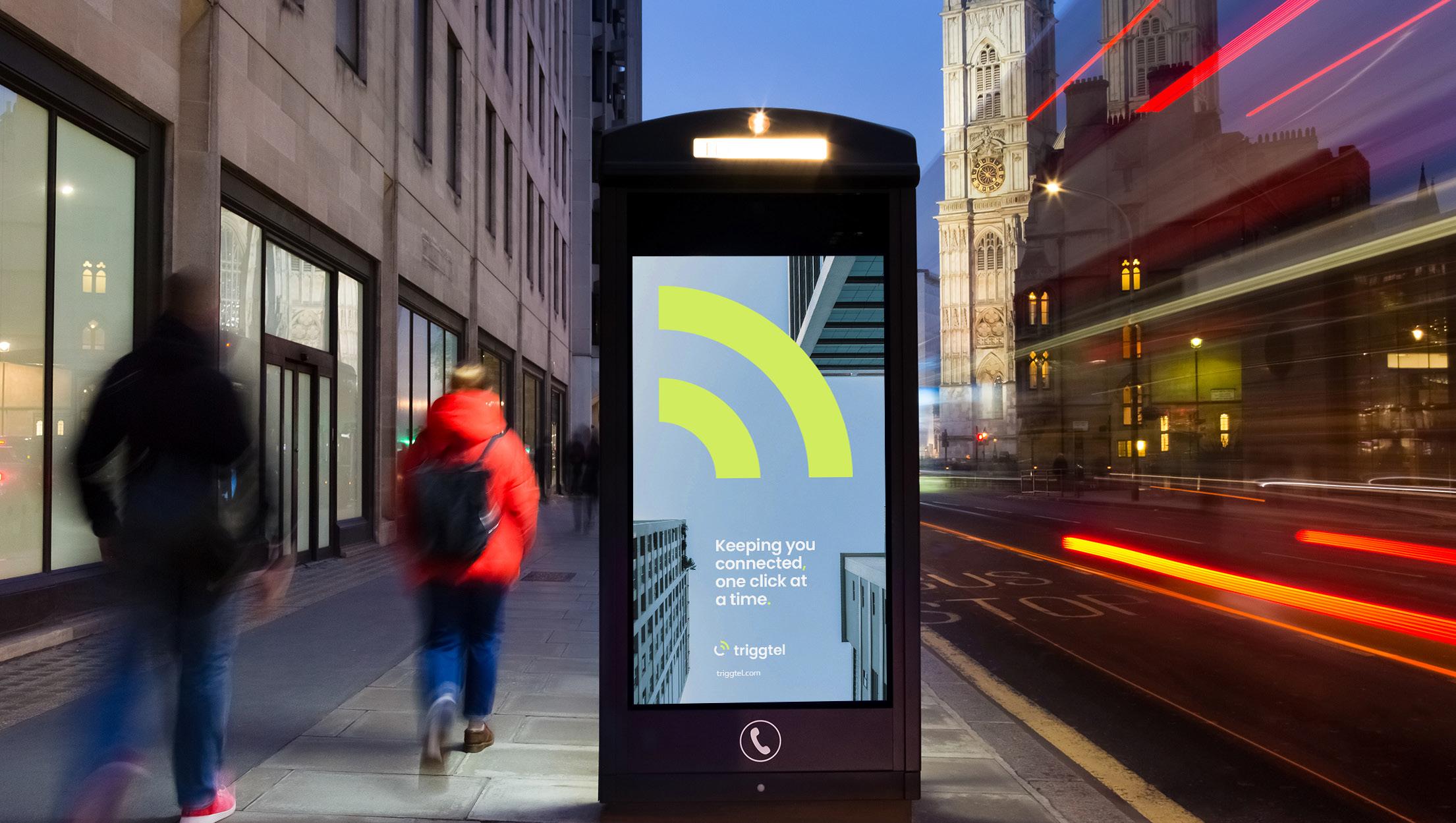
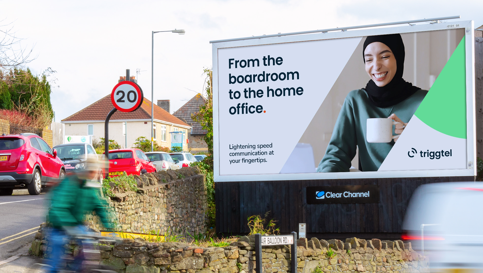
Our insights gave valuable direction for Triggtel’s branding. We realised that a clean, modern and minimalist branding route would set Triggtel up competitively and gradients, blue and excessive detail should be avoided in the branding. The marketing should use friendly and natural looking images of people on video rather than generic images of laptops and phones.
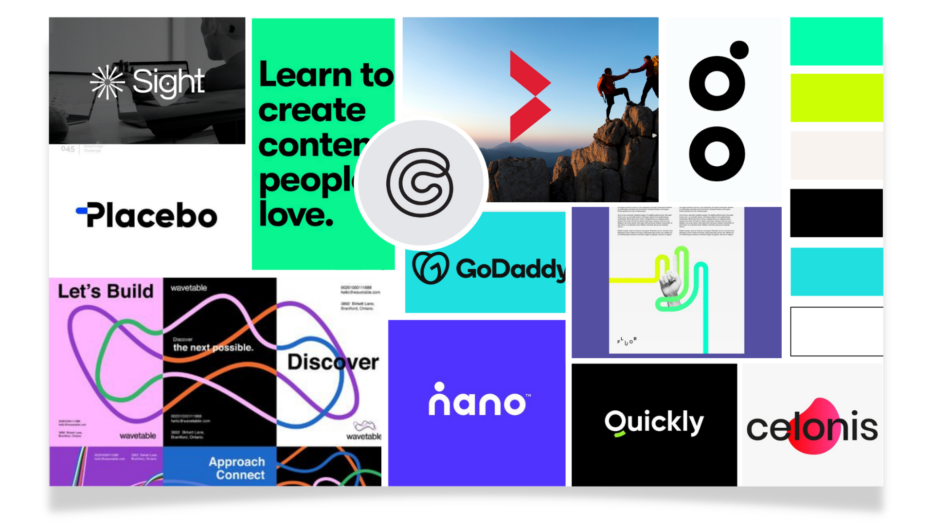
The Moodboard
Guided by these insights, we created a moodboard full of clean minimalist brand marks and neon brights.
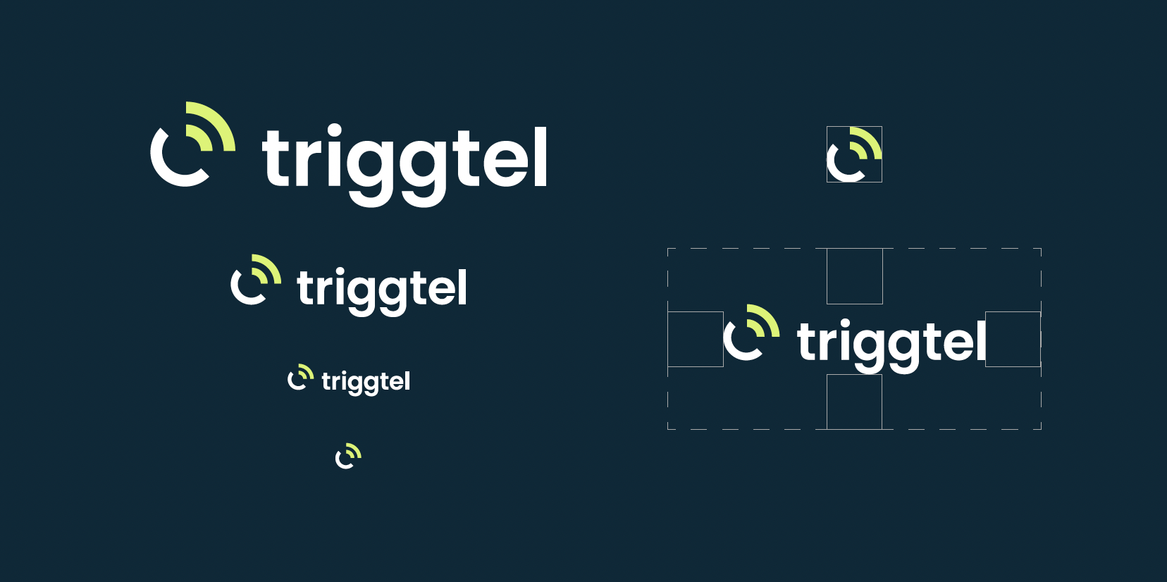
The Logo
We devised a clean, friendly wordmark in lowercase for a fresher feel, and explored several brand marks, including the final icon which is a simplification of the symbols for telephone and wifi, perfectly summarising Triggtel’s technology.


Clean lines and a 45 degree angle give the the mark an overall harmony
The Brand Identity
“Everything’s looking great, we have been really impressed with the work from Cara and the team”

As well as utilising the brand icon shape in the brand identity, we created a colour palette that balances trustworthy navy and grey with vibrant and energetic accent colours to keep marketing materials feeling modern, and highlighting the innovative technology behind the platform.