 Image 1 of 5
 Image 2 of 5
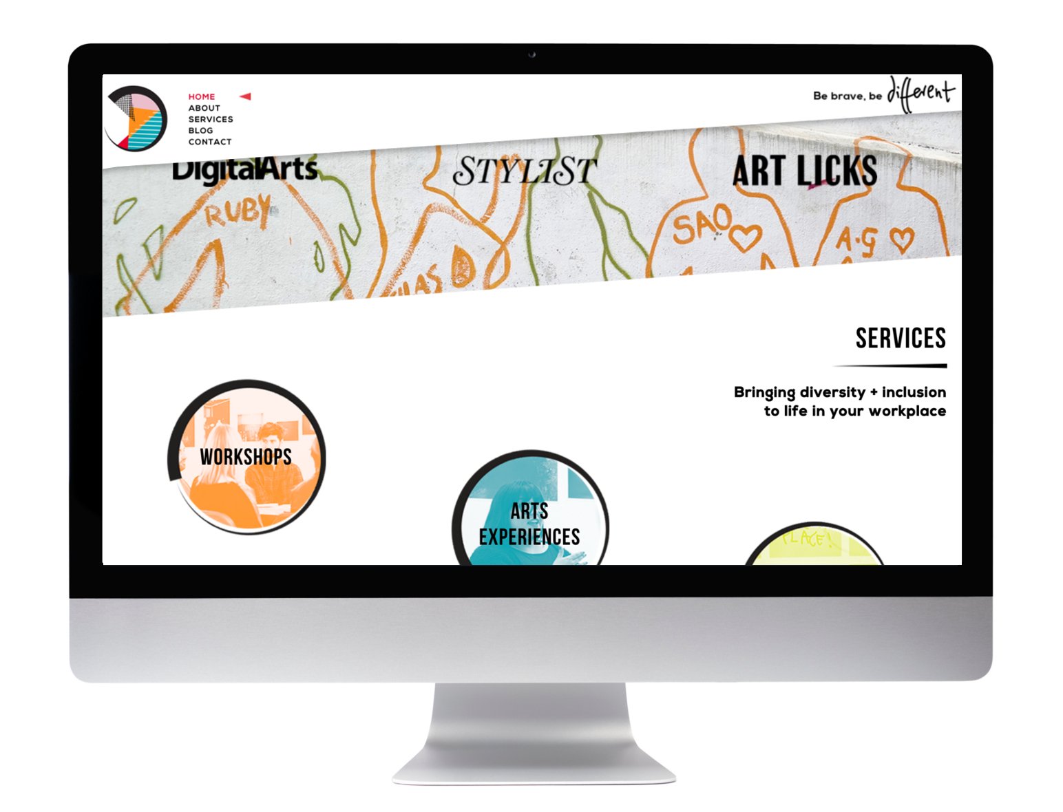 Image 3 of 5
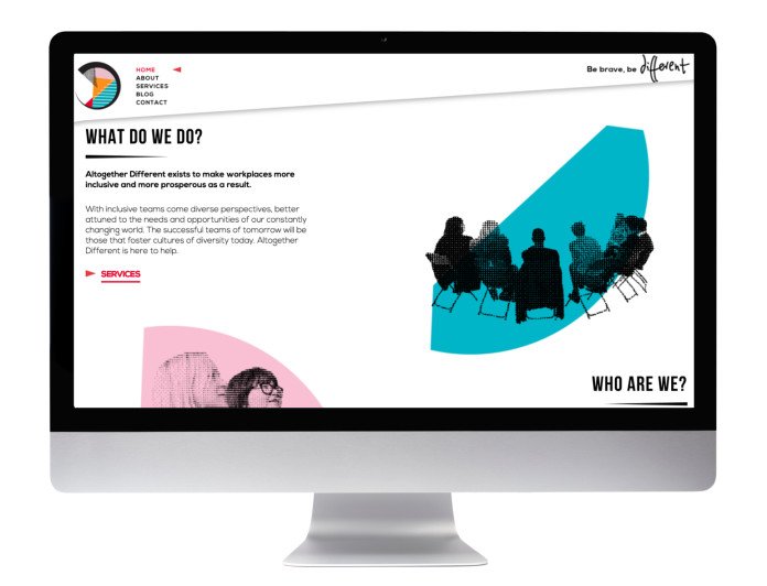 Image 4 of 5
 Image 5 of 5
Discovery
Right from the word go, Charlotte was very clear with us that, while her clients were mostly in the corporate world, the identity for Altogether Different should be anything but corporate. She wanted to brand to clearly communicate its message, while appealing to millennials and creative individuals, due to the business' method of using the arts to start conversations about diversity. Not an easy brief! But of course, we put on our thinking caps and got out our sketch books...
Moodboard & Concepts
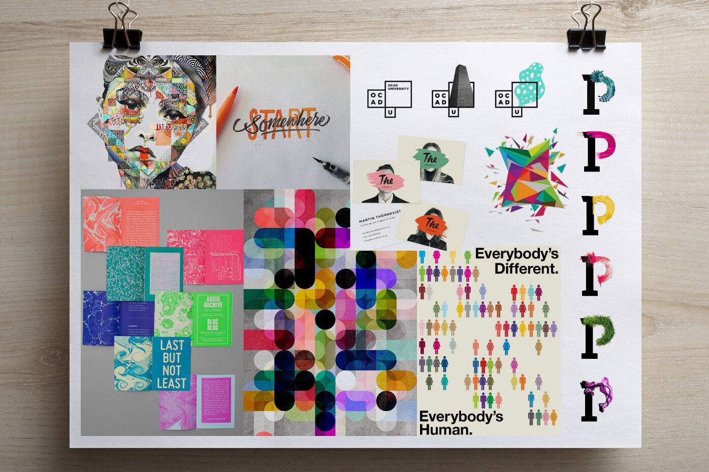
For the moodboard, my inspiration came from two sources: modular identities, which are, by definition diverse; and using textures from different cultures to represent cultural diversity. The ideas on the page were united by one thing – a bold use of colour.
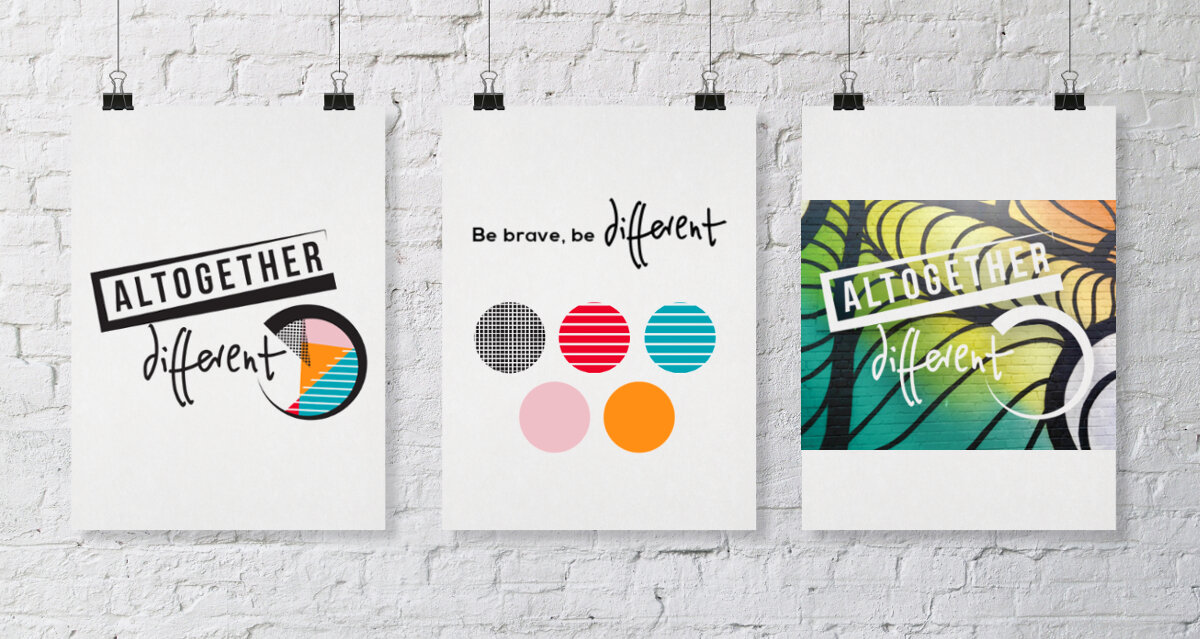
We came up with a few ideas, but both ours and the clients’ favourite was our modular logo concept, below:
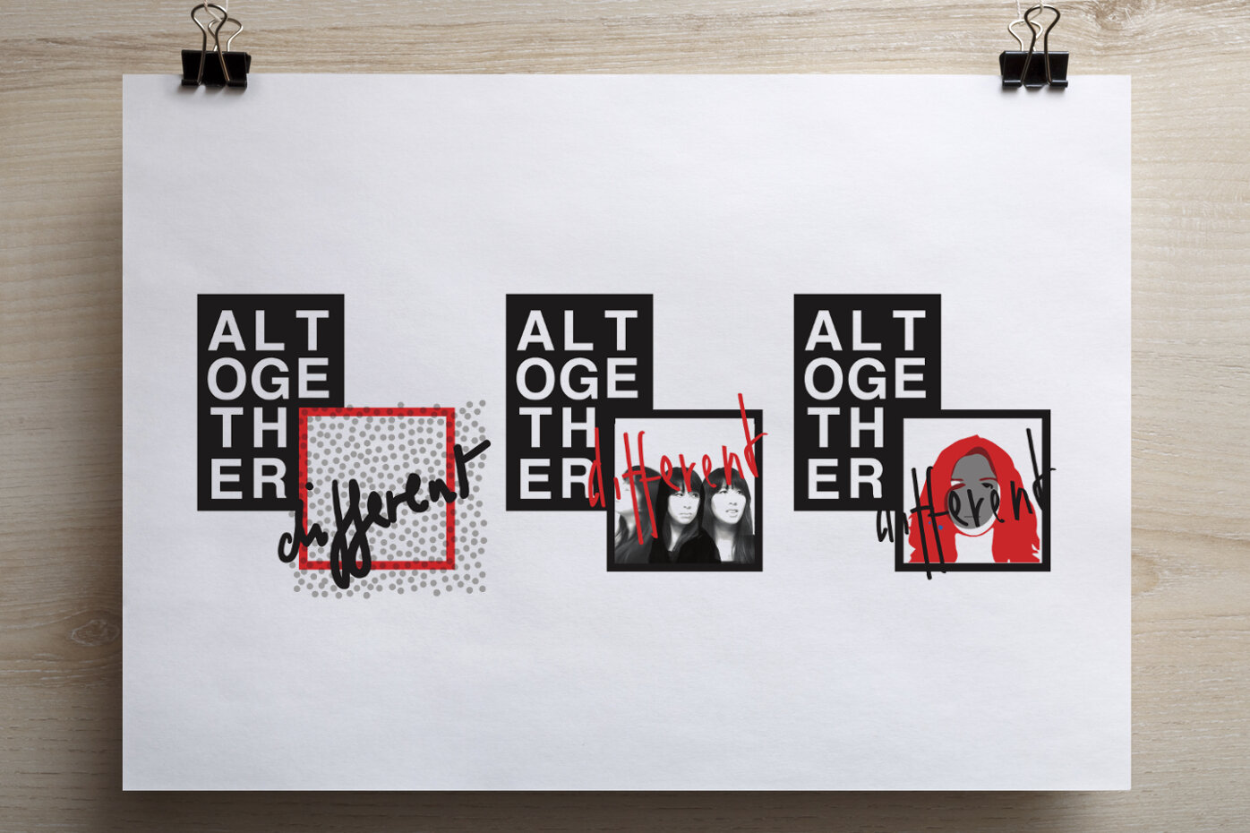
Charlotte loved the contemporary feeling and strong recognisable shape of this concept, but felt the legibility of the brand name was a little obscured, and that it should include more than one shape form to truly appear ‘diverse’ in its construction. We revised our logo concept with several sketches, colour and font explorations, and finally found ‘the one’.
Crafting the perfect identity
Contemporary and edgy, the identity owes a nod to the 1980’s and the various textures continue the sense of diversity
Peckham
Based in Peckham, to Charlotte, the area represents diversity and innovation perfectly. With a hit pot of different cultures, missed heritage, street markets, housing estates and 'new' hip millennial food and drink venues, Peckham is a place which is constantly buzzing, full of colour and flavour.
We drew inspiration from this and decided to place the textures of Peckham at the heart of the brand. Using the different walls - some graffiti covered, others crumbling bricks, and many covered in layers of ripped event posters and stickers.
The walls of Peckham
These became central to the brand, with memorable local walls forming the lead graphics on the website and business stationary.
For the business cards we included two graffiti walls, the Peckham peace wall and a local food vendor's shutter.
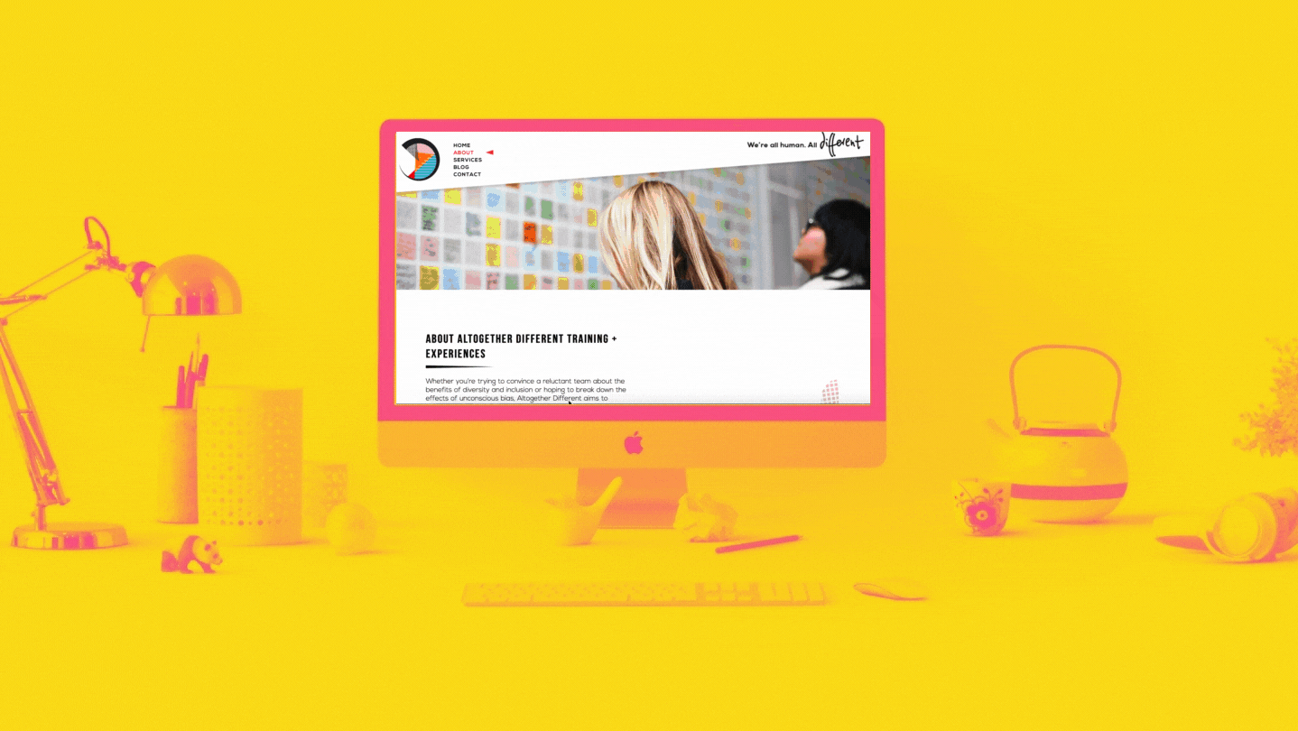
The website
The website needed to be two things: very contemporary, while feeling spacious and easy to engage with. With such a bold colour palette, it was hard for us to pair back to create a website with lots of white space, without compromising the vibrancy and energy of the brand.
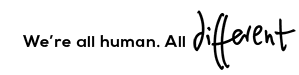
We also brought the brand ethos to life with an animated tagline gif:
We found a way by slicing through bold imagery with clean diagonal lines, using scrolling mechanisms to make the website spacious and intuitive (especially on mobile), and generous use of white around all text and imagery.

The result? Well, we were pleased, and more importantly, so was the client.
Why not see for yourself?
“Cara and her team quickly understood what I was looking for
and the result is a vibrant, adaptable brand and engaging diversity-focused website. A friendly team, with great ideas and a fresh and inclusive approach. Thank you!”
Charlotte Butler, Founder of Altogether Different