Image 1 of 1
The Brief
The centre will be a hub for the neighbouring community and includes some residential areas, a cafe, library, sports hall, conference facility and GP surgery. We were tasked with creating an identity that could encompass all of these spaces and appeal to a broad audience from young children to the elderly and young professionals.
The Moodboard
We decided to go for a brightly coloured, welcoming and fun colour palette to complement the interior design plans of the architects ADP. We took inspiration from bold identities, overlapping shapes and geometric typography for a friendly contemporary feel full of energy.

The Concept
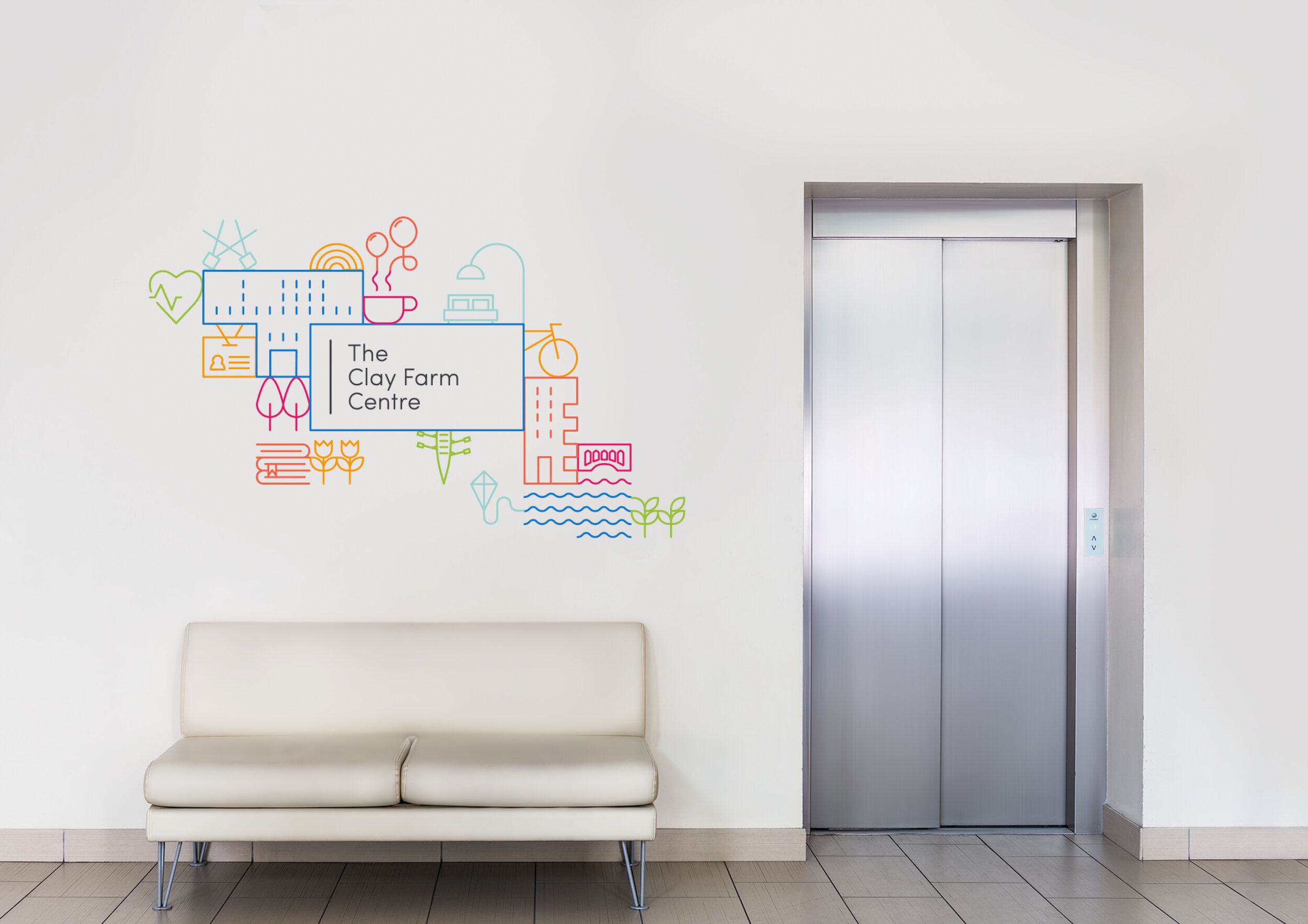
We did some work with the client on tone of voice and positioning before we began and from this the brand’s positioning statement ‘a place for everyone’ was born.

A Modular Identity
We presented concepts based on the keywords:
MULTIPURPOSE | HUB | COMMUNITY
CONNECTION | WELCOMING
Together we then chose to go down the route of a modular identity based on icons for each activity that might take place at the centre, and icons that represent the local area and history.
These each adjoin the main logo and come together in a grid pattern which creates a visual language system for signage and communications.