Earlsfield Capital Partners
SITUATION
Earlsfield Capital is a venture capitalist with a difference – rather than investing in start-ups in the UK they have a unique connection with India, allowing them to be able to handpick the best new tech opportunities from what is being dubbed as the next silicon valley.
They got in touch with us needing a traditional brand whilst also communicating their Indian connection, the USP of their business.
Discovery
We were brimming with ideas as to how to bring their three worlds together: Technology, investors and India.
The challenge for this brief was to combine these three worlds and create a cohesive brand identity
We held a brainstorm with the founders to decide which one of those three pillars the brand would have as its foundation. From talking to the team we discovered that it would be essential to align most closely to investors, but that coming across as too premium could easily put off start-ups.
We looked closely at both audiences and decided that a clean professional image with a sense of fun would help them achieve what they needed – to seem exciting & approachable while at the same time, trustworthy & professional.
Moodboard
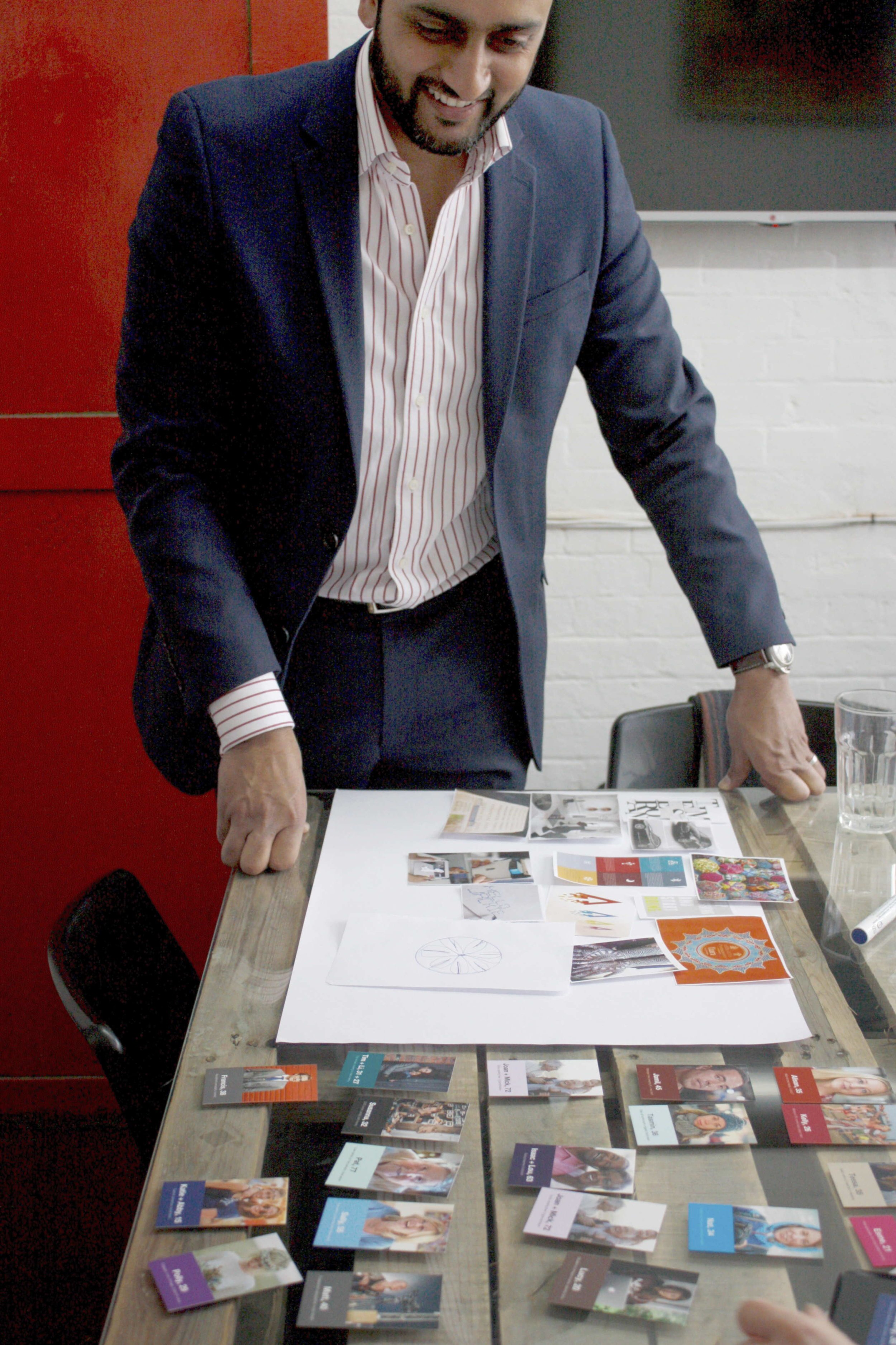
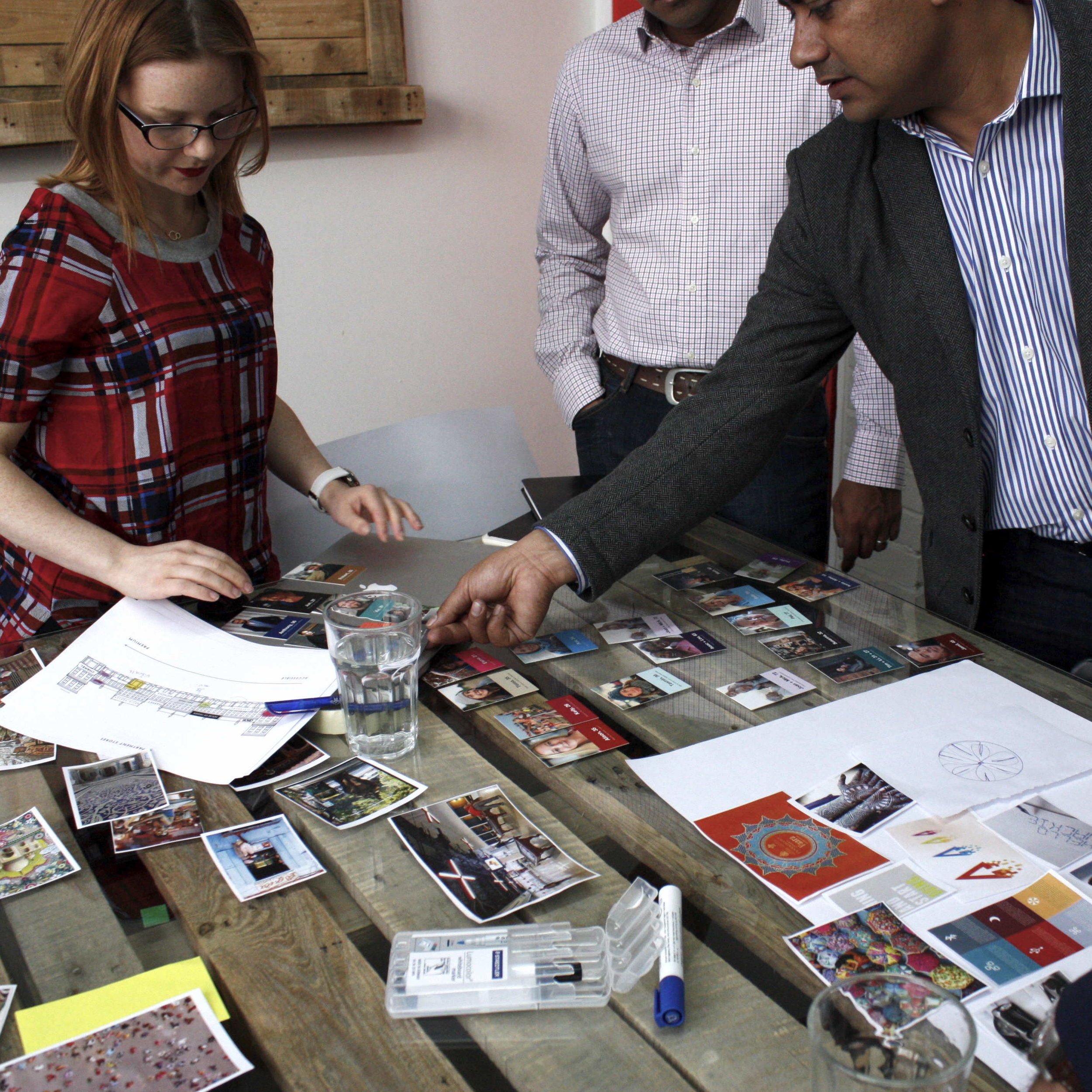
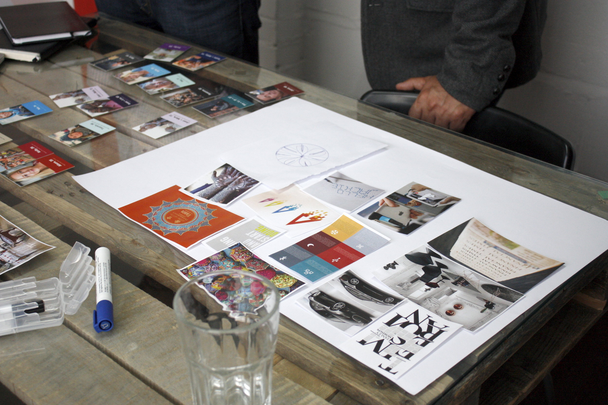
We worked on a collaborative mood board with the three founders to help us work out how much of each of their worlds would influence the look and feel of the brand.
We decided to borrow from India its vibrant colours and beautiful intricate patterns, to take from finance the look of something established and reliable and to let the tech ideas feedthrough depending on which concept was chosen.
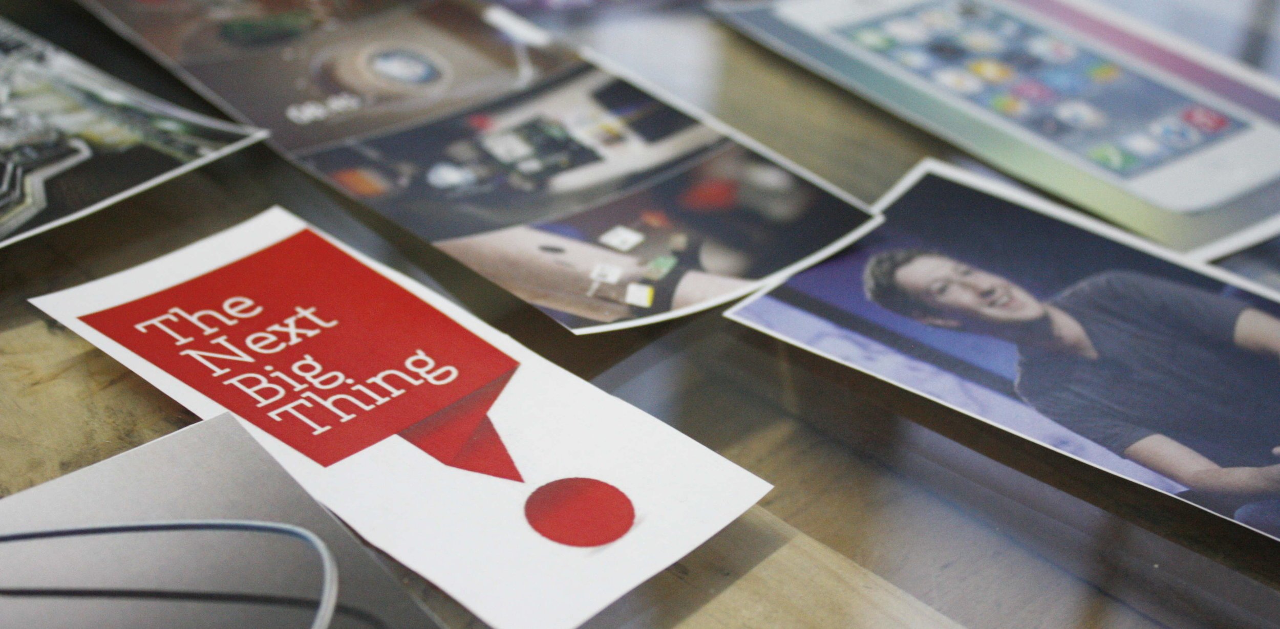
Cool, colourful and connected: our initial thoughts for the brand
Concepting
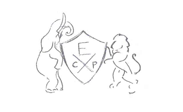
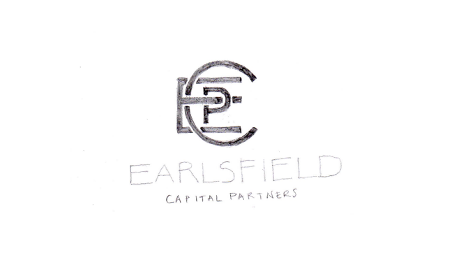
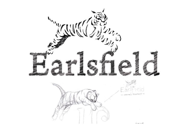
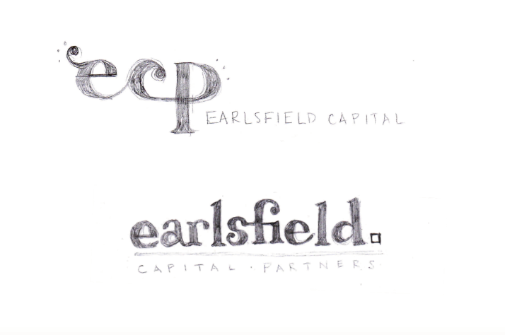
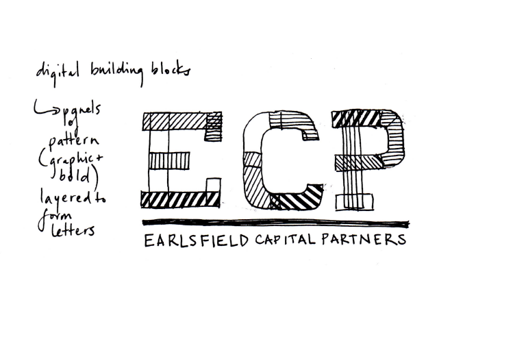
We came up with several concepts that we felt met this brief, from various different approaches. Heritage meet contemporary, East meets West, creating connections, and traditional order meeting the dynamism of new technology.
Design
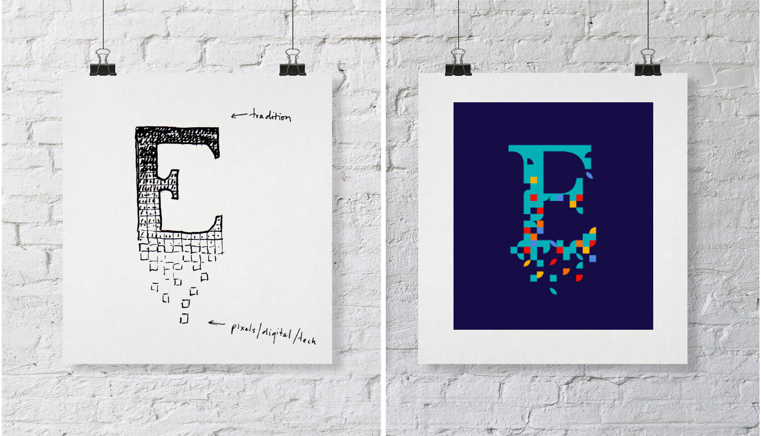
For the design, we took inspiration from the vivid colours of India against a traditional navy background to create a corporate identity with a twist. We tried several colour combinations, including orange, pink, green, blue, yellow and reds inspired by the spices, foods, saris and buildings in India.
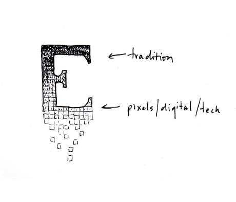
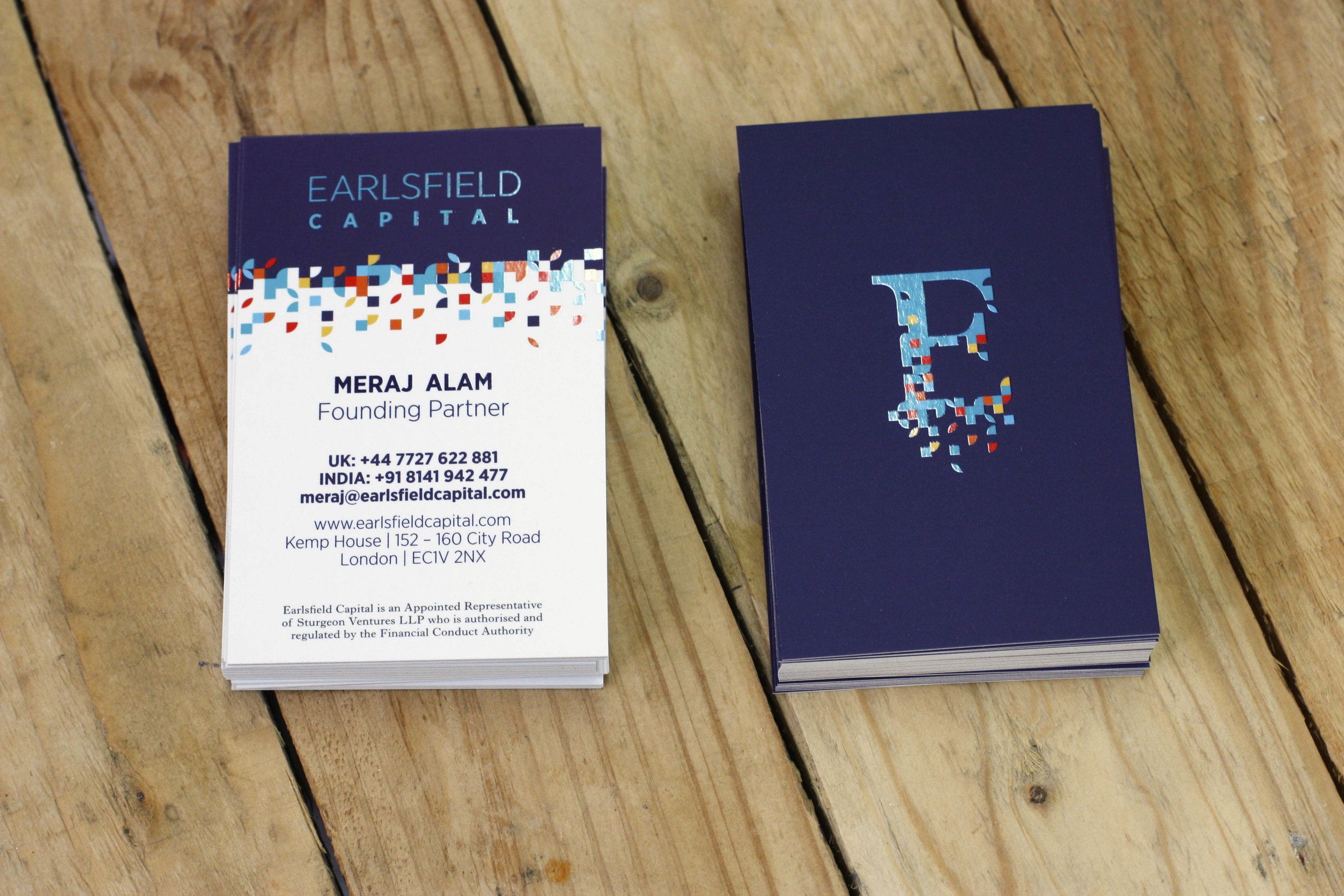
Earlsfield opted for this final concept: The shape of an E in a formal serif font, representing tradition and investment gradually breaking out into brightly colours pixels representing both technology and the colours of India.
Through the design process, we took inspiration from the world of newspapers and editorial to find an E character with stature and form. In juxtaposition to this inspiration for the dark background field and lighter colours came from the world of computer games and programming.
IDENTITY
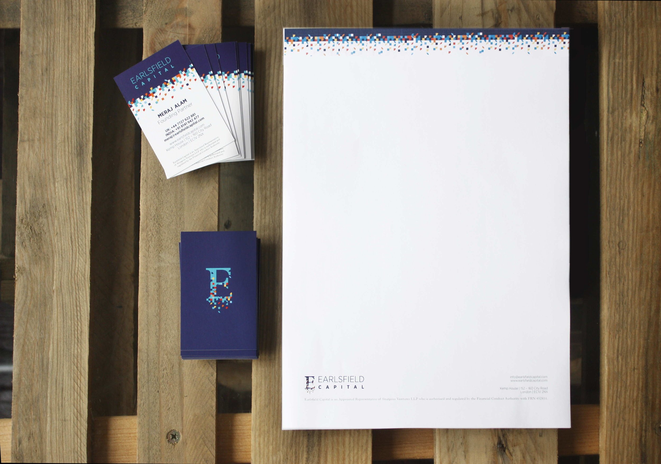
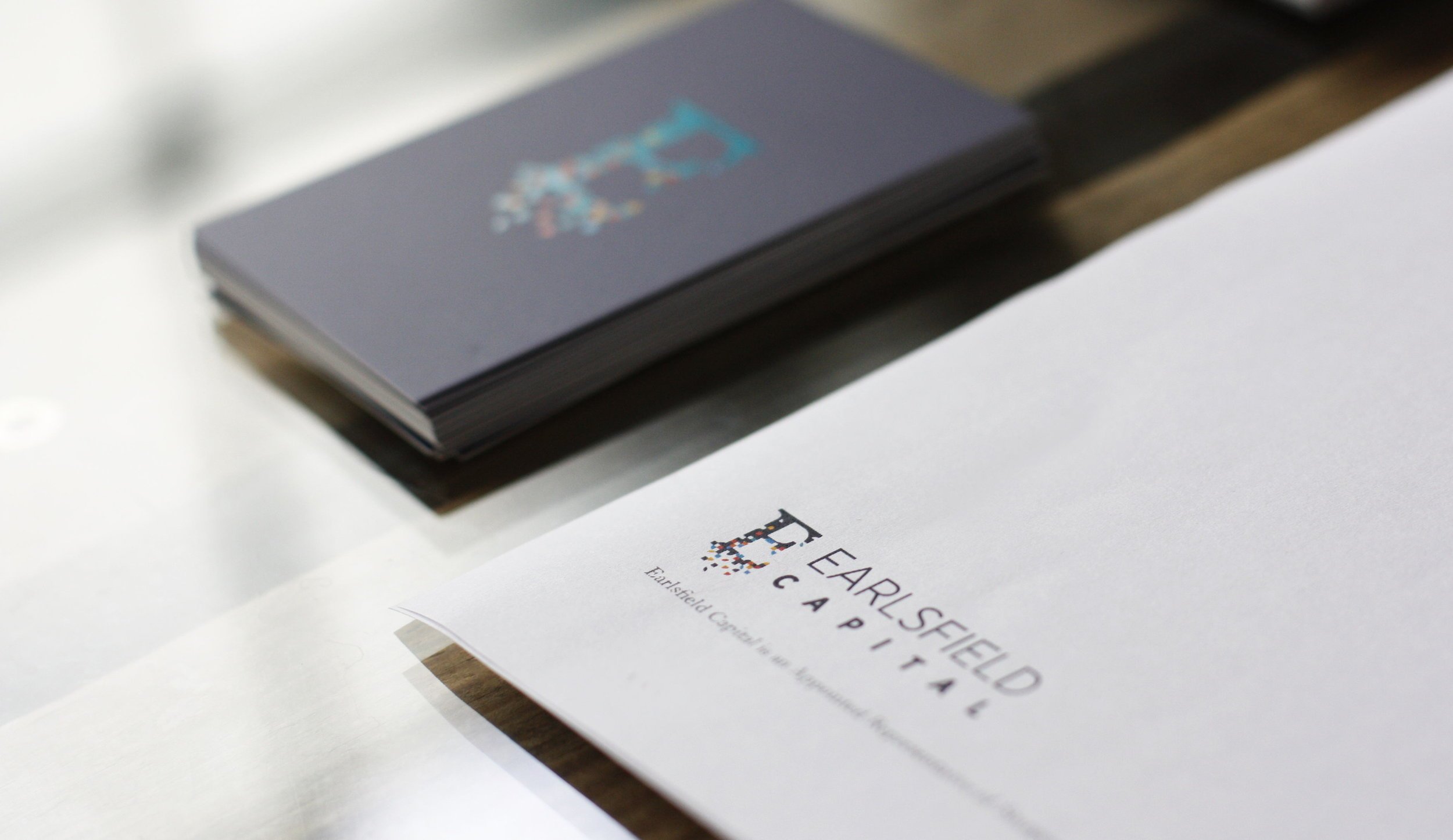
We produced a letterhead that is on brand but can be printed using office printers (low ink consumption) since most of Earlsfield’s communications would be digital.
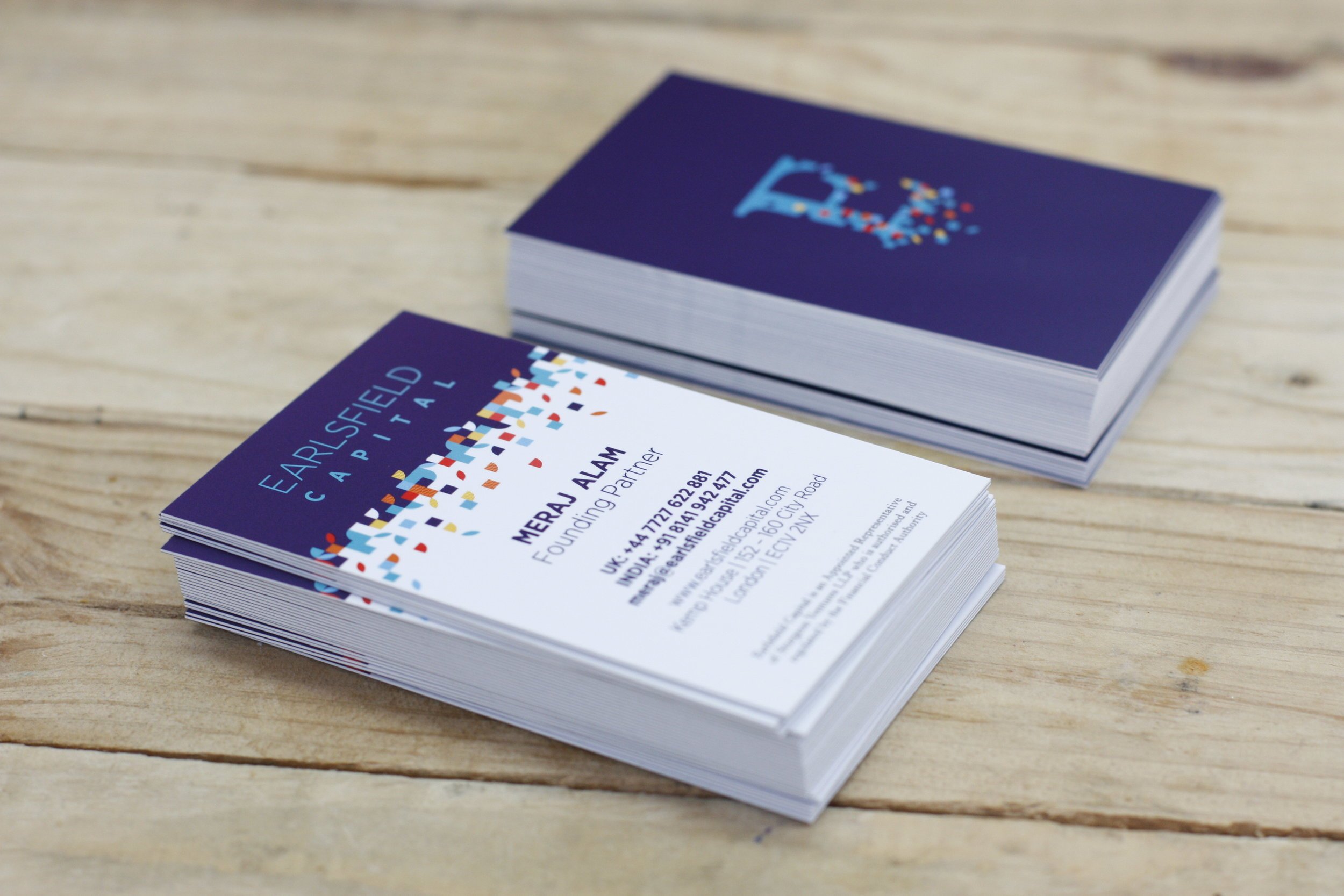
With the business cards, we opted for a matte finish and spot UV detailing on the brand mark and ‘pixels’ to give them a subtle pop. The vertical layout is also less usual than horizontal cards and highlighted the ‘industry standards, but different’ approach of Earlsfield Capital.
IMAGERY
For the website, we wanted to find imagery that would work to convey the excitement of the tech start up world, and the energy and spirit of India, all with an urban feel. We settled on a concept of movement – images of both London and India, all with one thing in common – streaming lights showing movement and energy.
Above: a sample of the photography used on website
WEBSITE
Keeping with the trend of many venture capitalist firms at the moment, Earlsfield opted for a modern single page scrolling website.
It was important to them that it was an enjoyable experience to be on their website, and not traditionally corporate. For this reason we built a responsive website that includes sections for their brand philosophy and to demonstrate their USP within the VC market – their Indian connection.
The website is built purposely to allow them to grow with additional sections for case studies and active deals available to be developed once their business has grown.
We also supported Earlsfield in the creation of consistent branded social media channels in advance of the launch of their website.
