Yes to Coaching
SITUATION
Maggie Chu is a California based sales pro and coach who, after years as an expert in her field, decided to branch out into running a sales coaching programme, Yes to Coaching, based on her own extremely successful sales techniques. Her business model was based on helping women similar to herself, who are ready to start up alone as coaches but need the extra help to improve their sales pitches, and drive up their conversion rates.
Discovery
Maggie approached us to create an entirely new brand, starting with logo and finishing with rolling out an entirely new website. We discussed her key demographic and ascertained it was predominantly female qualified coaches, in their 30’s to 50’s, who need motivation & practical sales tips, to enable them to become successful.
The word ‘empowering’ became the heart of our approach to Maggie’s brief; we wanted to create a bold, confident, uplifting tone of voice without sounding ‘too good to be true’. Balance was needed to create something bold in message, but visually classy and elegant.
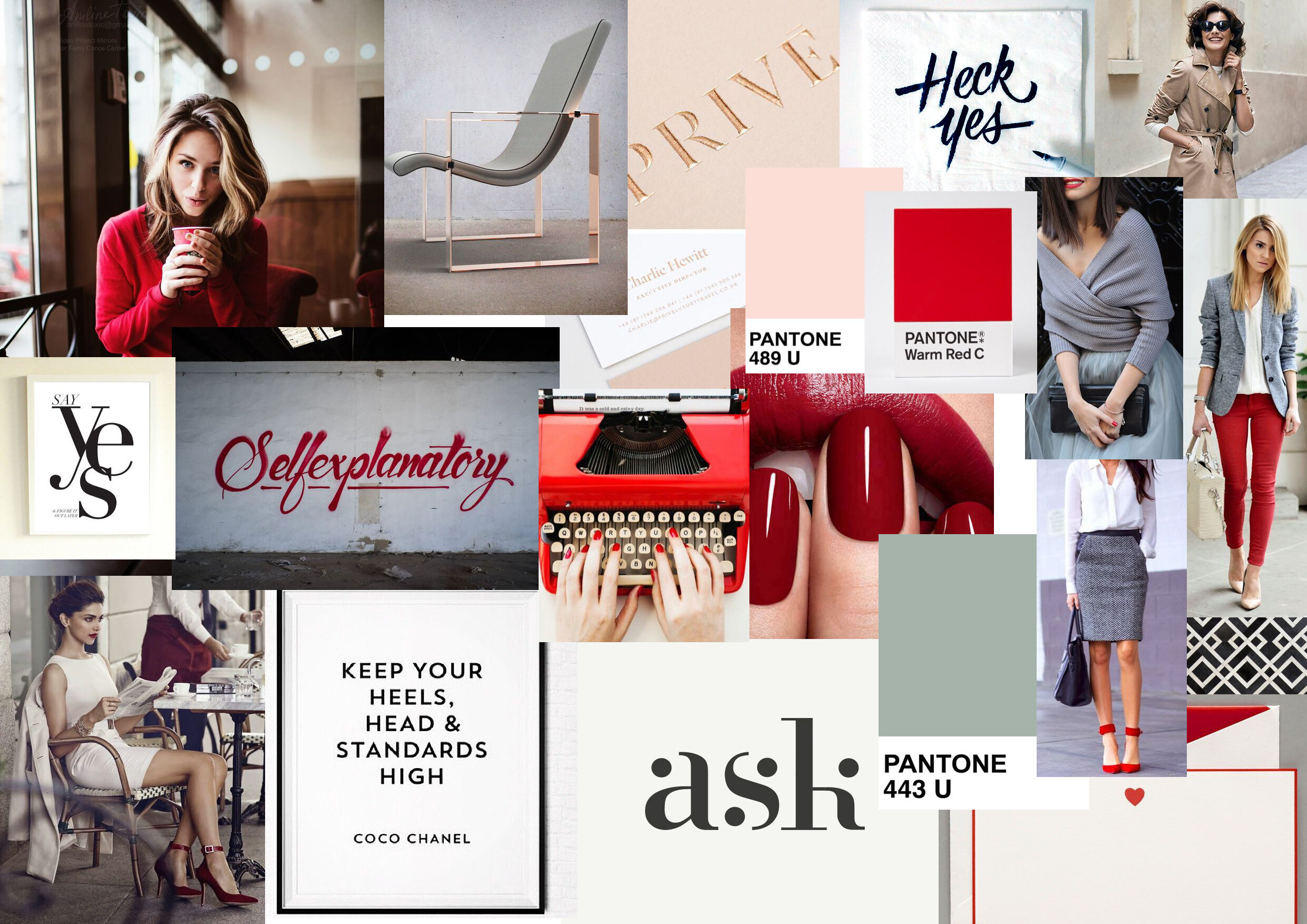
The choice of bold red in the moodboard conveys the confidence we wanted to brand to portray
The word ‘Yes’ wields a lot of power; it evokes proactivity and positivity.
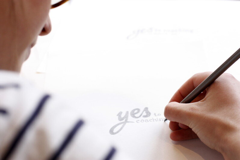
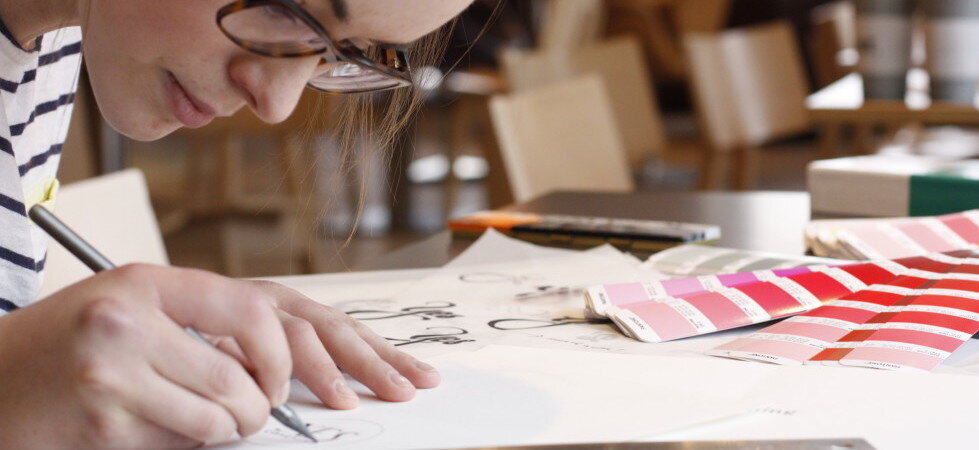
THE LOGO
We placed a lot of importance over the design of Maggie’s logo - as a coach, it is unusual that Maggie operates under a brand name rather than simply as Maggie Chu and we wanted it to have the feel of a household brand, so we looked to some other iconic logos to create a distinct and uplifting script style logo.
A small gold arrow – like a ‘play’ button – was added to the logo as an symbol of taking action, giving some room for manoeuvre for motifs later on in the identity design.
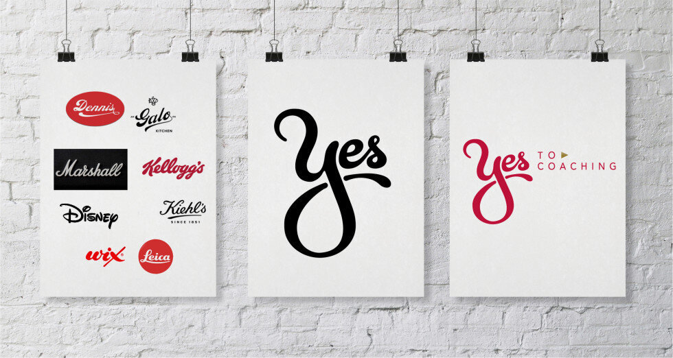
We took inspiration from classic and iconic script logos including Leica, Marshall and Kellogg’s for a bold playful ‘Yes’ brand mark
Identity
With a strong logo in place the rest of the identity organically began to take shape. The plan had been, from the early stages, to compliment the bold red with elegant and subtle tones, so the inclusion of a deeper red, a champagne and a sea foam green brought the identity together.
The triangle motif from the logo is continued in the identity as a bullet point, or as the basis of the two brand patterns.


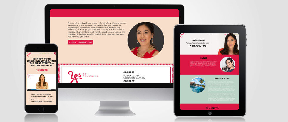
We also designed and built a Wordpress website for Maggie