
Twisted Lingerie
Situation
Sophie Thorne, founder of Twisted Lingerie, approached us to develop the branding for her new company. Sophie came up with the idea for Twisted Lingerie as she felt the market lacked an affordable erotic-inspired lingerie brand, so we got to work building a set of designs that represented her target customer and aesthetic.
Sophie also required an e-commerce website to be built from scratch. Utilising our best web developers, we created a site that was user-friendly as well as eye-catching.
DISCOVERY
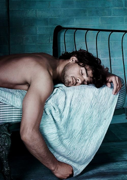
Sophie wanted to portray the brand as sexy, confident, and rebellious. As a long time lingerie lover herself, she was used to lusting after items from luxury lingerie brands such as Coco de Mer and Agent Provocateur, and she knew there was a big gap in the market for a brand that could give the same seductive/luxury lingerie shopping experience, but on a budget. With the average set at Agent Provocateur demanding £250, Twisted’s sets would all be affordable under £50. A huge feat from an independent brand, with main stream brands such as Bluebella and Asos having a big share of the market in this price range. However, what these brands weren’t delivering customers was the sense of illicit excitement, the thrill of the naughtiness, delivering garments in beautiful black tissue paper lined boxes, rather than plastic mail bags… The challenge was on. To create a provocative, female centred ‘luxury’ lingerie brand for those without the budget for the high end labels.
MOODBOARD
Through a discovery session, we developed a mood board that captured this mood in a unique way. The moodboard had a number of rope elements, which then became the inspiration for our development of the logo.

DEVELOPING THE LOGO
We began by sketching concepts for the logo using the word 'Twisted' to inspire twisting typography, interwoven with female silhouettes and the shape of twisting rope.

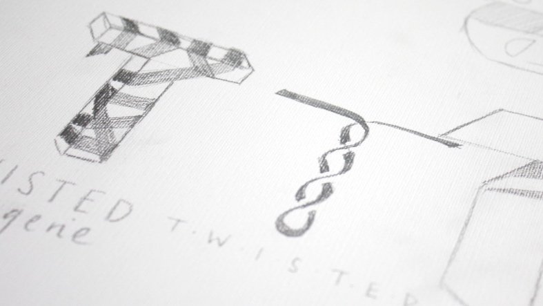
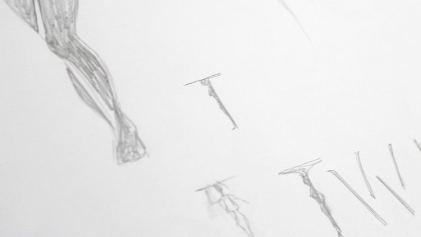
As the creative process developed, Sophie decided that the reference to bondage rope needed to be made more explicit within the brand mark, and we explored ideas where letters were entrapped in rope, and replacing certain letters with rope, handcuffs and whips.
THE FINAL LOGO

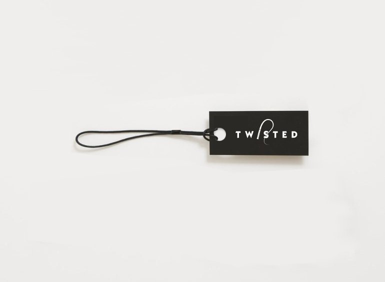
By replacing the 'I' in Twisted with a whip, the brand mark is both simple and provocative. The whip handle is bold, with strong grooves balanced with an elegant swoop of the whip, that intertwines around the curves of the 'S' shape, much like the lingerie is designed to frame the curves of women's bodies.
We decided that the whip should become the brandmark for Twisted, so we created a shorthand version of the logo where it whips through the ‘T’, to be used in small spaces or where the whole brand name has already been used.
THE COLOUR PALETTE
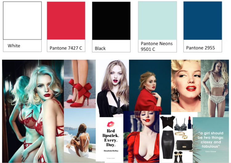
While this logo seemed most effective in dramatic monochrome, we wanted to pair this with a sensuous colour palette to bring the brand to life across social media, website and the lingerie packaging.
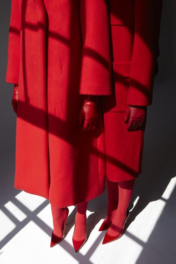
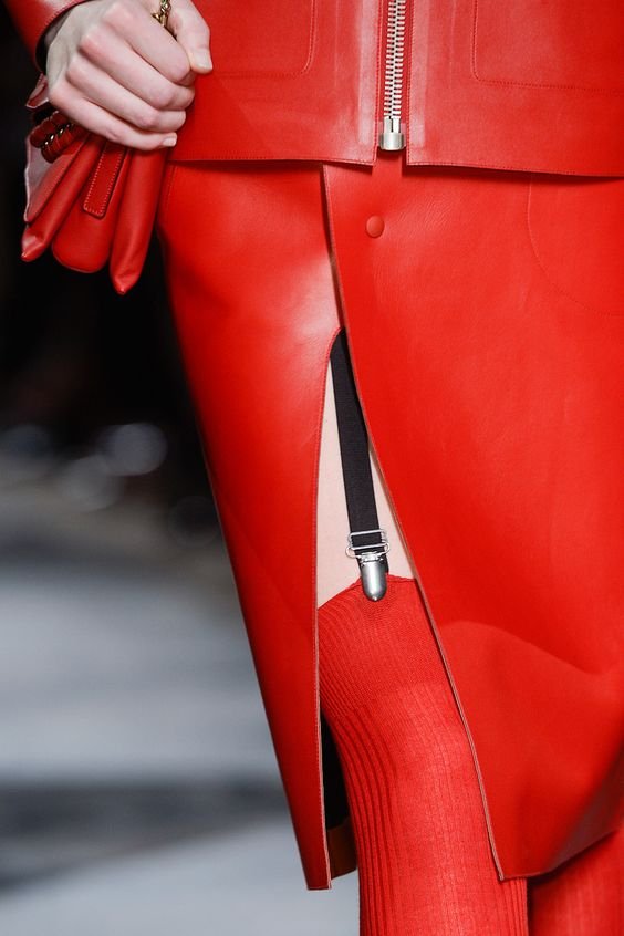
Lipstick red was an obvious choice - exemplifying the glamour, sexiness and boldness that Twisted Lingerie inspires in the wearer. We opted for a rich pink-toned red and paired it with a petrol blue and youthful aqua for an identity full of fun, confidence and energy.
ROLLING OUT THE IDENTITY

TWISTED LANGUAGE
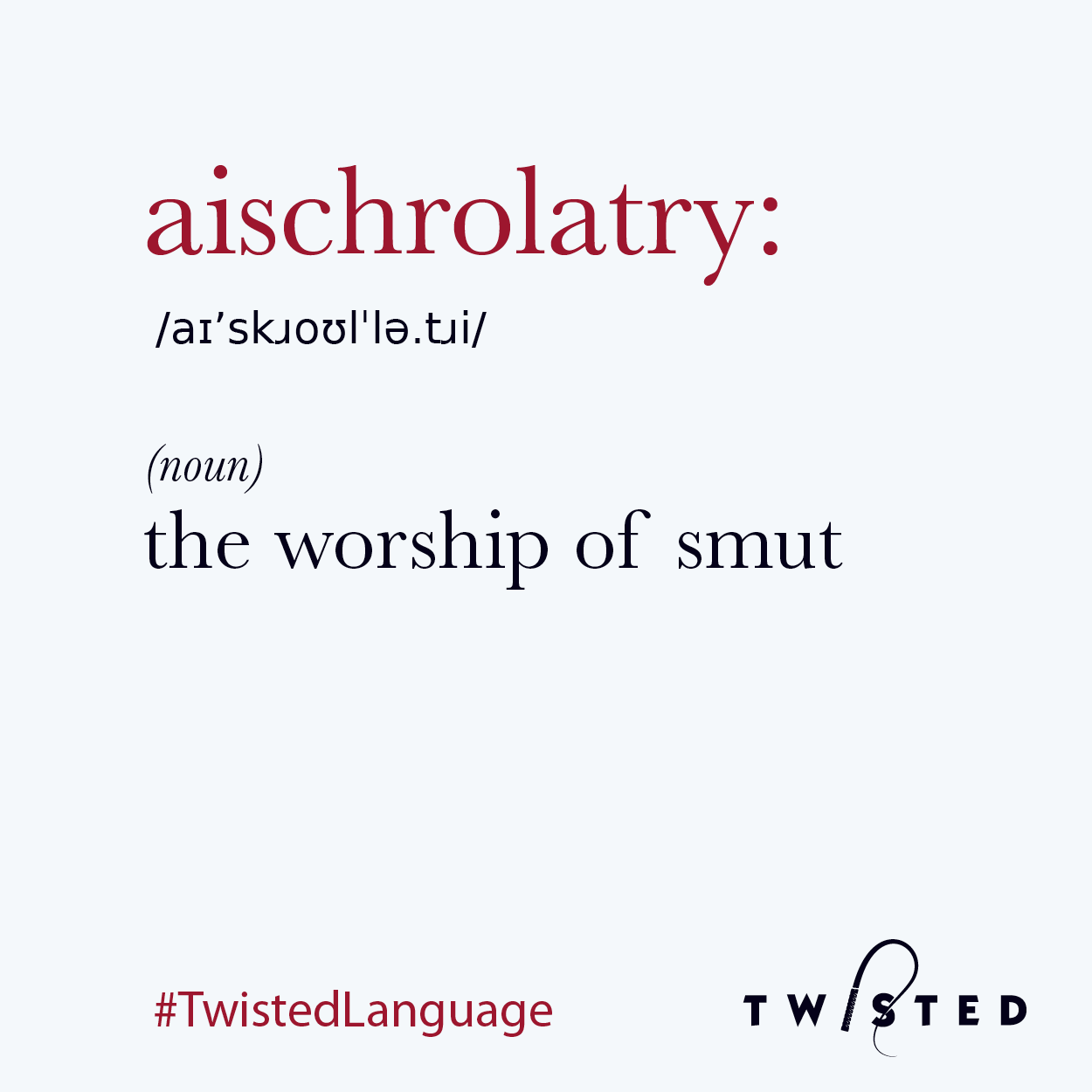
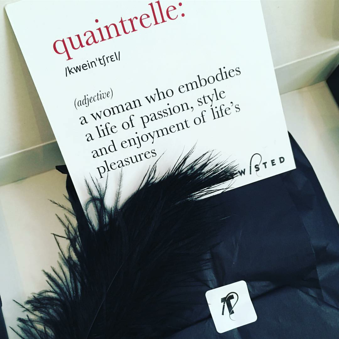
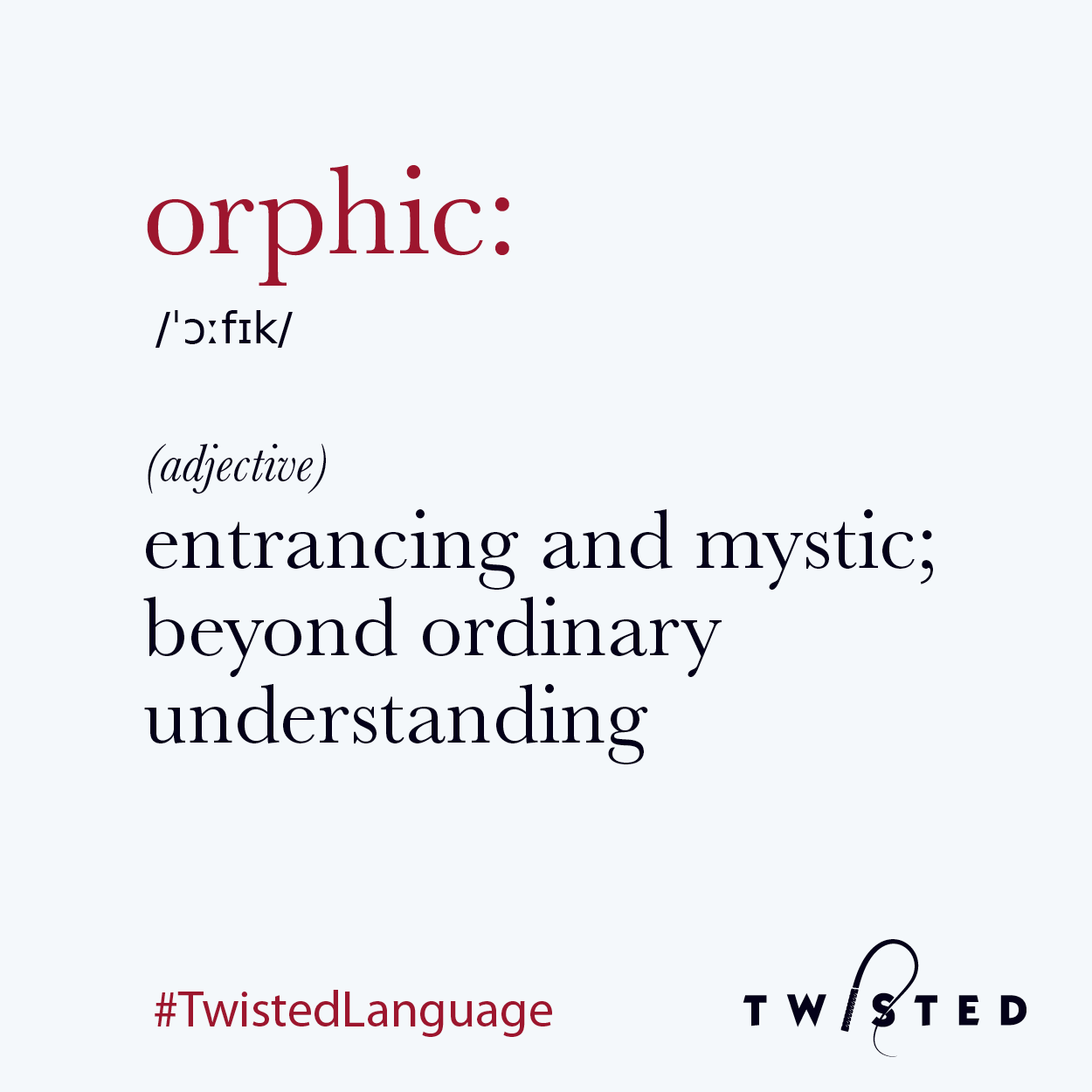
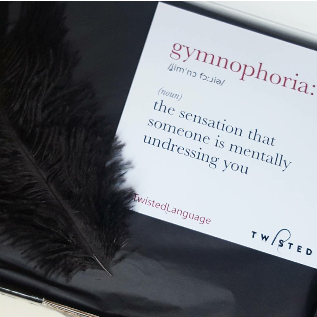
This idea came up from something on Sophie’s original Pinterest for the brand - she had a whole collection dedicated to men and women reading books, and that being sexy. Since the products themselves are revealing, and a low price point, it was imperative for the brand that it didn't seem cheap or tacky, and so we a sapiosexual philosophy for the brand - that intelligence is sexy.
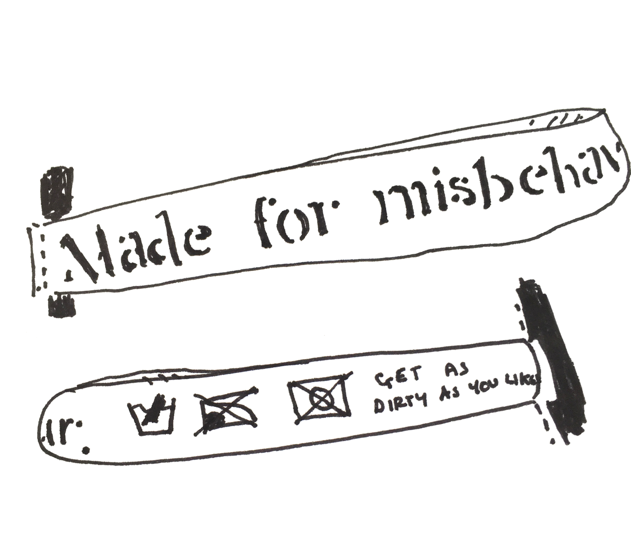
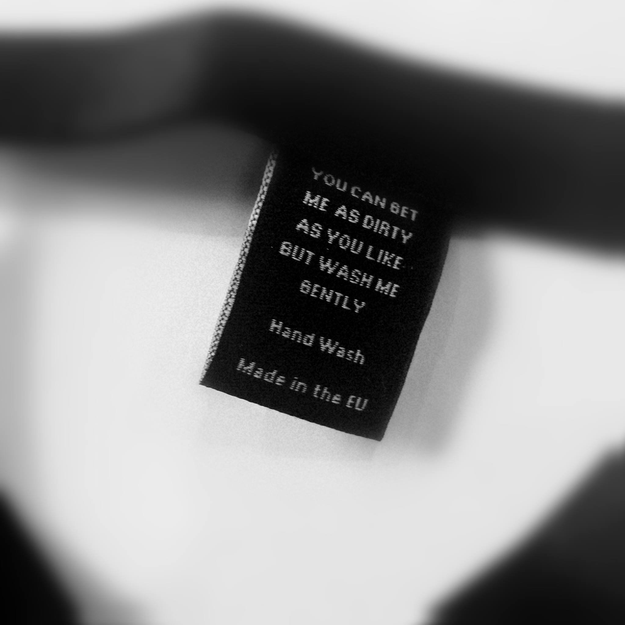
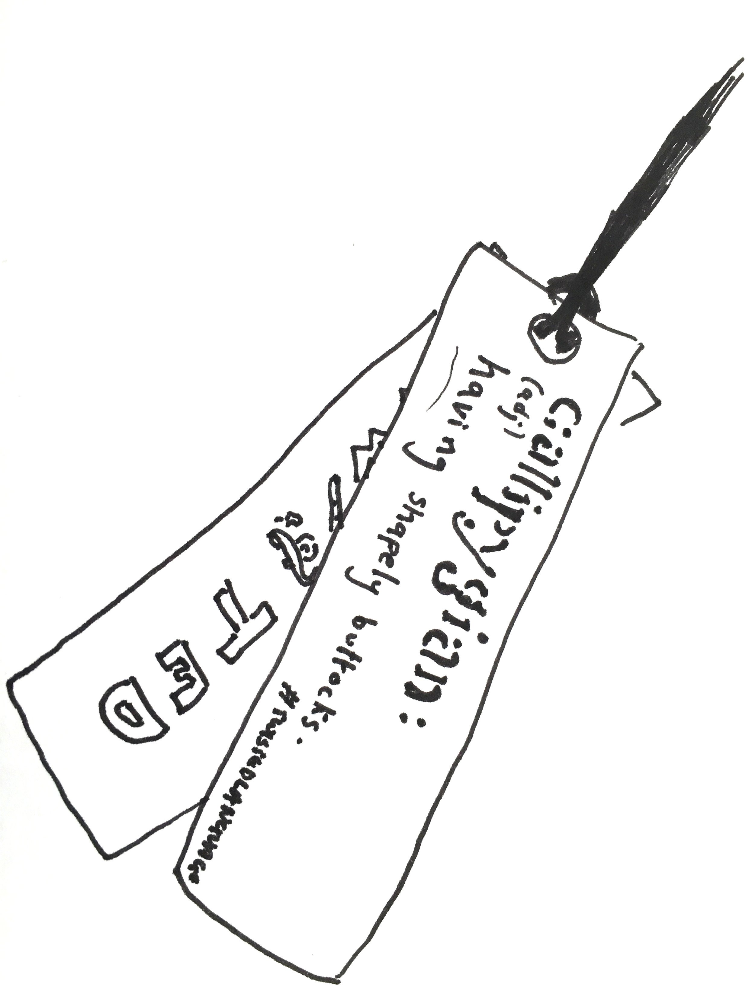
We researched many Scandinavian and old English phrases, finding words that perfectly described certain sensations of situations, and created a set of cards with some of these words on to be placed into the garment packaging.
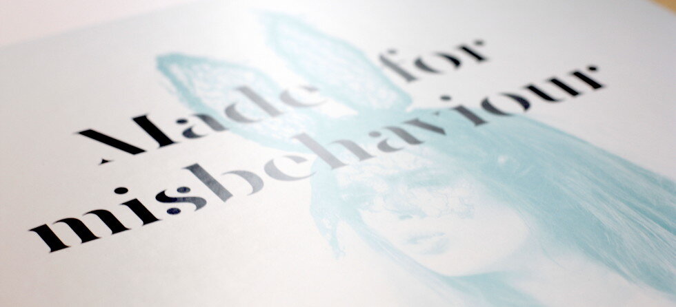
Working with Sophie on the tone of the brand, we decided it should be cheeky, self-assured and relatable. The tagline 'Made for misbehaviour' conveyed the right level of decadence and playfulness. In contrast with the super simple logo font, we chose a font full of personality and glamour, with a little edginess, for the tagline.
APPLYING THE BRAND
We worked with Sophie to create a content plan for her blog and social media, balancing all the important areas of the brand’s values and aesthetic.

We also generated social media content that related to this and established the brand’s colour palette for the first few weeks of content on Instagram, in order to generate pre launch interest.

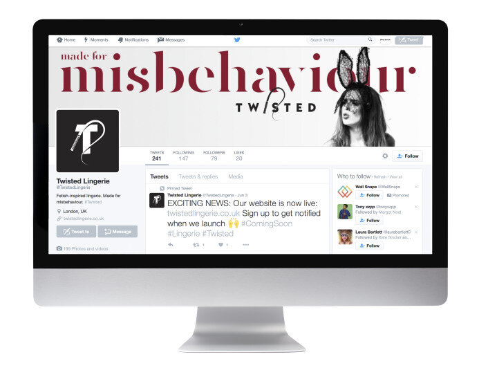
The branding on display on Twisted Lingerie’s Twitter account upon launch
We also advised on the packaging, item labelling and any other opportunities for little brand touches that would help the brand build up a following.
WEBSITE
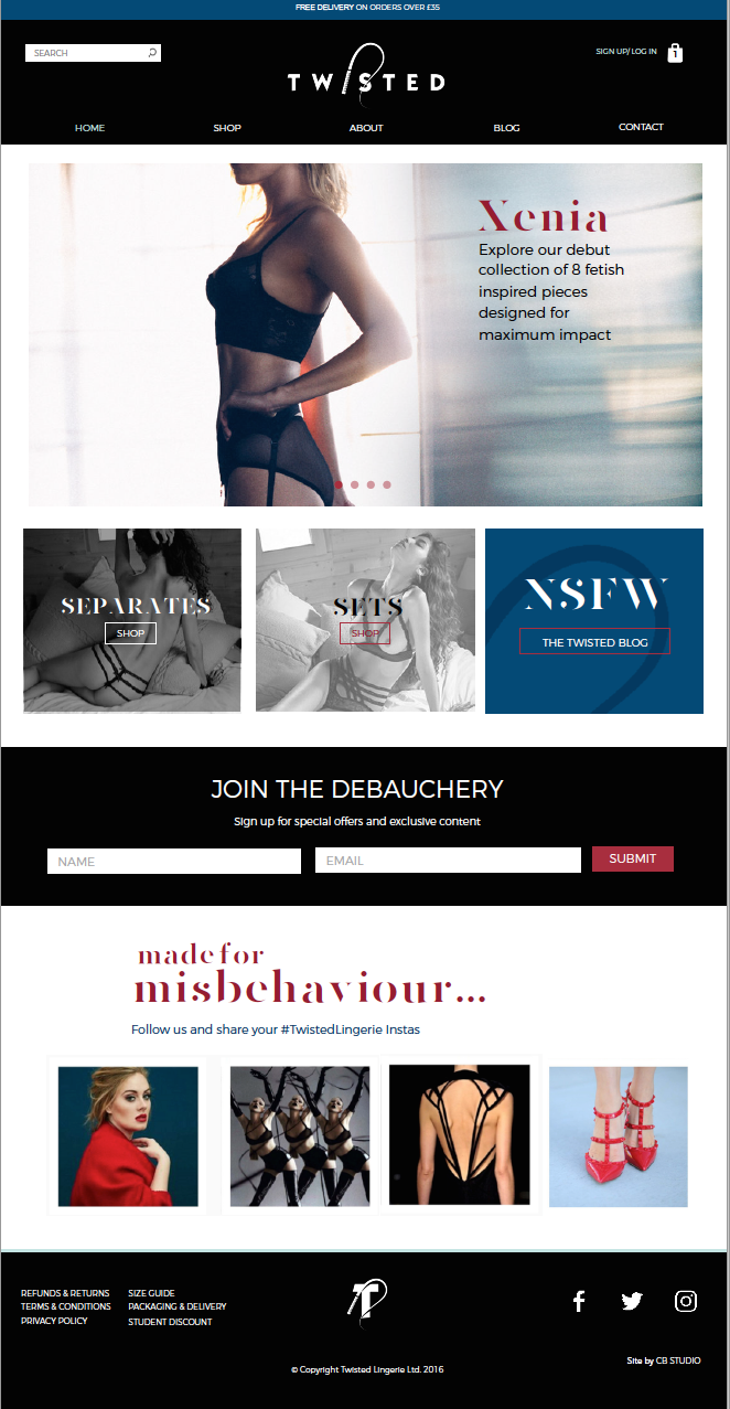
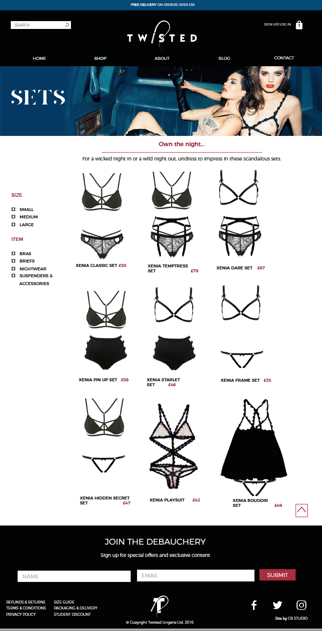
Having a good user experience was key to Sophie for the Twisted Website, so before we developed the website, we conducted user research on other e-commerce shops, blending the best practices seen on each website to create a smooth and useful user journey.
This included having multiple ways to shop the lingerie: by searching for an item, viewing as separates, viewing as sets or clicking through from any of the visual cues on the homepage. Like many much larger brands, we also coded the site to offer similar items on each product page, and a way to shop both items on one page, in different sizes, to allow for the smoothest customer experience.
As with the whole image of the brand, the design was sexy and sizzling with lots of the provocative tone showing in the copy, the blog named ‘NSFW’ (Not Suitable for Work) and a cheeky 404 page.
2019 Update: After 3 years in business, Sophie decided to sell Twisted Lingerie to a larger lingerie retailer. Ever entrepreneurial, Sophie now operates another business, supporting women in business.